Interactive
Interactive media is a way in which users can interact with the programs software. It allows people to connect with others and it makes them active participants in the media they consume. Unlike normal media it is meant to enhance a user's experience, they normally include a moving image and graphics, animation, digital text, video and audio. I have used interactive media in the past, I used it to create a poster where people can scan a QR code and that QR code will take the user directly to a URL of my choosing. I find interactive media so more enjoyable than the rest because instead of looking at a normal poster, an interactive poster could offer the user so much more. In a way, they work in more ways than you can imagine, if you think about it a person cannot take anything away from just seeing a poster. In some situations people look at media in particular posters and think I would like to buy that item, but if it is hanging in the street they will be unable to complete their wishes of owning that particular piece of media. But if you was to add an interactive feature to it, for example a QR code that person could find out who made that piece of work and contact them directly. Basically when you include an interactive feature you are able to give the user an opportunity to participate with the media.
For this project I could do a number of things, these include website design, anaglyph design, playing cards, board game and kinetic typography. Out of all of the options listed the ones that I find most enticing are the playing cards and the kinetic typography. With the playing cards you are able to design any illustration you could think off. You might not want to go for the traditional look of including a King illustration on a King card, so in this project you could do absolutely anything you would want to. Maybe you want to follow your favourite game and include the main characters in that or even your favourite film. If I am going to use this form of interactive media I would create it of my favourite game, that game is Cyberpunk. In this game there is a wide variety of different characters I would be able to include, therefore it gives me a lot of options on who I should include on what card. With the Kinetic Typography, you are able to create anything you could possible want, the only thing that is set in stone is that the media is moving. I touched on this area before, the area I touched on was motion graphics. These seem to be along the same line but kinetic typography seems to target typography. So for example, you could include a song lyric, for example "There's no escaping the jaws of the Alien this time". This song lyric is from Michael Jackson Thriller, you could transform this song lyric in many different ways. If I was to transform it I would consider having all the words turn into blood and have them dripping down the screen. As we all know the visuals of that song are meant to be scary so including the idea that I had in mind follows the theme of the music video.
Project Proposal
The project proposal is the initial document I have used to define my project. The proposal includes the rationale, the project concept, the evaluation, proposed research sources and bibliography and the project action plan and timetable. The rationale gives you the freedom to discuss your progress and achievements throughout the first 12 units of the qualification. The project proposal gives you the opportunity to discuss the concept for this project. Also you are able to discuss your aims throughout the project this includes production of your idea and the research you plan to conduct. The evaluation helps you explain how you will reflect and evaluate your work. Also you are given the opportunity to describe how you are going to record your decision making. To fill out the proposed research sources section you should include initial research sources and both primary and secondary sources that you intend to use in your work. This section needs to be filled out in Harvard Format. Before I move onto the next section, this section was the most difficult out of all. I have completed the previous sections before so I am no stranger to them, however filling out the research section in Harvard Format was new to me. I have never done this before but luckily there is a website called Neil's Toolbox that made it a lot easier. You have to find multiple details regarding each source of research, for example, you have to find the author of the website, the article title, name of website and a few more little bits. But once that is all filled out the website makes the information into Harvard Format. But you are not done, once you make all of your intended research sources into Harvard Format you have to put them into alphabetical order. The final section is the project action plan and timetable, in this section it gives you the opportunity to fill in your plan for the project, you will create a plan for each week of the project and allows you to keep a good amount of organisation throughout the project. Overall, I found filling out the project proposal fun as it nice to see all of my ideas for the project in one place. I feel that I could talk forever about some of the ideas but thanks to the word count I limit myself. The only section that I had a bit of trouble on was the research section but like I mentioned earlier, the website that I used made filling out that section quite easy.
Research Plan
To start with I will talk about what primary and secondary sources are, both sources cover the same basics and that is of course research. The difference is that when you are conducting primary research, that research has been conducted on your own behalf. For example, you created a poll on social media where people could go and vote. On the other hand secondary research is finding research that already exists. For example, finding tutorials in your chosen area. In a previous project I didn't know how I completed an action on Adobe Photo-shop, so I decided to research it and found a tutorial. This counts as secondary research because I wasn't the one who created that tutorial, I am using someone else's research source. In this project I am to gather both, secondary and primary research sources. For primary research I am to create a social media poll, this poll will help me see what my target audience likes and dislikes about the designs I put forward. I could also create a survey, this will allow the target audience to go in with a bit more depth with their feedback to the designs I create. The final piece of primary research is going out and finding decks of playing cards that already exist. Therefore, I can see features that I might not have thought of for my own set of playing cards. For secondary research I am to create a mind map, I would be able to use this as a form of idea generating. I also would like to make some mood boards, this will make it easier for me to see all the inspiration I have gathered in one place. Finally, I could look at different designers, this could benefit me as I am seeing what works well and what doesn't in terms of designing.
Primary Research

Inspirational Sources
Due to the current events happening the world today I didn't think it would be a good idea to go out and conduct some primary research. Also
most shops that I would visit are shut at the
moment. So I thought of the next best thing and I
found some playing cards in my house. These
playing cards that you can see are PG tips
inspired cards. For the Kings, Queens, Jacks,
Jokers and Aces, they all have the old monkeys
that were used to represent the brand. These can
only be seen on the high rated cards, this is
obviously to signify what cards they are. So as
soon as you see a card with an icon on it you
know that you have pulled a high ranking card.
This is something that I would like to introduce
when it comes to my own playing cards. As I am including icons on every card choosing the high ranking cards might be difficult. I think for the high ranking cards using the most important players and other icons will be the best option. Therefore people know when a certain main player has been pulled they know they have a high ranking card.

Taking another look at the PG tips inspired playing cards, I wanted to have a look at the originals, the playing cards that everyone has seen
or played with. As we all know, on the original
set of playing cards they have their separate
icons for each high ranking card. Much like the
set of cards I recently looked at. But there is a
particular feature that the original set of cards
have that the others don't. On the high ranking
cards their images are flipped. So any orientation
that you view the playing card the icon is the
right way round. The reason behind including
this set is to see how that feature I just spoke
about is done. It is clear to see that when the
icon is flipped there is no line dividing the two
sides of the icon. At the bottom of each icon
they match up perfectly, I think I could introduce
this idea in some of my cards but not all. There is also another area that I wanted to cover on the original set of cards and that is the back design. As we all know the back of the cards are normally the area that separates each deck of cards from one another. So by researching different card back designs I am able to see what features I could include to make my design different from the rest.

This piece of primary research is different compared to the previous sources I have touched on. I thought that I would touch on the topic of
the playing cards. As we all know I have decided
to cover the theme of Cyberpunk. When I
bought the game it came with multiply postcards.
On the right you are able to see a few of them.
Looking at the postcards it is clear to see that
they all include different forms of typography.
But there is also something that they share and
that is located on the top half of each postcard.
They each have a bright yellow colour way and
included in that is the main logo. Looking at the
type of typography used, I find it really interesting.
These postcards also give me some ideas for my
own playing cards, as we can see they each have a form of typography so this gives me the idea to include the name of the feature in the main Cyberpunk typography. Therefore when any card is drawn you know what feature is on that particular card.
Polls
To start gathering this source of research I had to find a suitable website, this is where I came across https://www.strawpoll.me/. Once you open the page you are given 4 options, the first is the question you want to ask, then there is the Poll options. Once you have filled those areas out it is time to create your poll. You are given the chance to share the poll, and of course this is perfect for the times that we are in at the moment. So I shared my poll with some people around me and I gathered some answers fairly quickly. I started off by asking what suit should the characters belong too?, the answer that came back with the most responses was Diamond. So I then moved onto finding a suit to match the guns with. In this poll I removed the Diamond option as we already know that is paired with the characters. So once the poll had been answered a few times I found out that the most voted answer was Clubs. So now Clubs was out of the answer I only had two left. This final poll would help me decide which suits I should match the two lasting themes with. So I released another poll and this was to find out which suit I should match the cars too and the results were Hearts. This then only left me with one suit to match locations with and that was Spades. I find that creating these polls come in handy in many situations. Don't get me wrong I could have paired each theme to their own separate suit. But I thought it would be best to let my target audience decide, as they are the most important factor in this design. If I am making the target audience happy I am making sure that once the cards are complete there will be people wanting to play with the cards I have created.


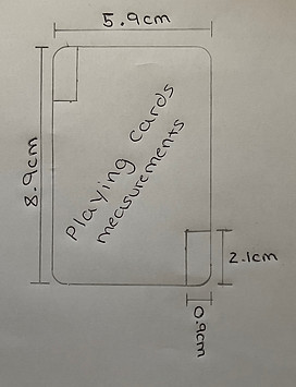
Measurements
Before moving to the design stage of this project I thought it would be important to gathering some research regarding the measurements of playing cards.
To gather this information I used a deck of playing cards that
I found laying around my house and I then chose a playing
card that I then traced around. Once I had completed the tracing
I moved onto adding the measurements off the playing
card. As a whole the playing card is 8.9cm (89mm) in length
and 5.9cm (59mm) in width. I thought that it is all well and good
having the measurements of the card as a whole but there is
some additional features that I need to account for. This includes
finding the measurements for the number and letter, I found
that this space on the card is 2.1cm(21mm) in length and 0.9cm
(9mm) in width. Finding both of these measurements gives me
a clear look to see what areas I have to play with when it
comes to designing. After finding these measurements I realised
how little space I do have for the features I intend to add. Although there is little space I still want to make sure all the features I do add can be viewed and the players can see what the features are. To do this I could do some test fits, for the characters I could only add the top half of their body, for the locations I could add the most important area, for the guns I can put them at a diagonal angle so then I have more room to enlarge them and for the cars I could also place them at a diagonal angle therefore when I add them they do not look too small.
Secondary Research
Mind Map
A mind map is an easy way for me to brainstorm thoughts and it allows me to see all my ideas in one place. This will be the thing I look back on when deciding what idea I am going to use for this project. Out of all the ideas below the Cyberpunk playing cards are definitely my favourite. I feel that if I am going to go for this idea it allows a wide range of creative skills and I am also knocking down two cans with one stone . This means that on the mind map below below I have listed four things but only two main topics. What I am planning is that if I finish my playing cards earlier than I anticipate I am going to move onto creating a form of motion graphic, this is very similar to Kinetic Typography. So in reality I am hoping to complete one main idea and use that idea to cover another topic in the same project. My idea for the motion graphic involves me animating one of the playing cards. For example if one of the characters I intend using has a weapon I could animate that card to fire, or even if the character has a musical instrument I would be able to animate them playing it and include music to go along with the movements they are doing. What I like about making mind maps is that I am able to think of relevant ideas one after another. When I make mind maps I might only have one idea but by the time I have finished writing down the first idea I have already thought of a second one, it is like a chain effect almost. The Mind map you are able to see below was created on Adobe Photo-shop and overall I am happy with the way it came out, if I was to redo the design I would consider making branches coming off the main circle as to what I have now just looks like they are not part of the mind map. So to tie everything together I would consider drawing branches therefore everything looks like it belongs together.

Mood Board
A mood board is a visual tool that helps all our concepts and ideas to be seen all in one place. As you can see above I have created a mind map, the mind map helped me gather ideas and now I have chosen the idea, I am able to create a mood board about that chosen idea. So as you might already be able to tell I am going to use the Cyberpunk playing cards idea. The mood board is a way for me to see a lot of different styles of work all in one place. What I like about mood board is that each design holds its own visual value and each design will benefit me in this project. As we already know designing a deck of playing cards is going to be a challenge, so seeing all my inspirational ideas in one place will benefit me highly. On each separate playing card there is going to be a separate character. By having this mood board it has enabled me to come up with a better idea. In the mood board there is a piece of work, it is top middle. This design shows different characters but all these characters belong to the same gang. So my idea would be to include those characters onto one set of cards, therefore when you look at the cards you would know that when you see those characters they belong to the set of hearts for example. Without this mood board I wouldn't have been able to come up with that idea so by creating this I'm sure further down the line when I need more inspiration and more ideas looking back at this will help me gather those ideas. Now I have gathered some more ideas I could make more mood boards just around one idea. So for example the idea I just mentioned, I could now go away and create another mood board just about that specific group of characters. Therefore when it comes to designing I know everything there is about that chosen group of characters.


Like I mentioned earlier looking at the previous mood board helped me think of new ideas that I am able to use for this project. There was one image in the previous mood board that helped me think of that idea but I thought that including the one image wasn't enough. I needed to find out more information regarding that group of characters. Before I created the mood board I didn't know the name of this group of characters so the first thing I did was found out their name, and their name is The Maelstrom Gang. They all have these bright red eyes and when it comes to designing the characters on the playing cards I really want to emphasise those big red eyes. Due to the rest of their bodies being dark and gloomy, making sure I really capture the eyes they have will really benefit the design. As well as including the original image I gathered some separate ones too. All of these images are of course related to this group but seeing all of these images really helps me visualize the way I can include them all. As we know my idea is to include them in one suit of the card deck. To fulfil this idea I will need to think of 13 different designs. I would like these designs to be different from one another and I know that the images included in the mood board will be able to help me think of different designs for each card in the suit. Overall, I am happy that I have thought of some ideas for the project and now all I have to think of is the 3 other suits and also the design for the back of the playing cards. Going off the ideas I have produced, I think including a theme for each suit is a really good idea and I look forward to see how I can turn that idea into a reality.

After thinking of some ideas for different suits in the card deck, I thought it would be best if I made a mood board regarding another suit theme. This suit will be based on the main characters in the game, to start with I didn't quite remember what the names of each character were so I quickly looked them up and started on the mood board you can see below. Name by name I went adding the characters to the mood board, there were some problems that I ran into, like some of the characters didn't have any images about them. So for those situations I just moved onto the next character on my list. Seeing all the characters in one place will really help when it comes to designing the cards. It also means that when I am designing I will not miss a character out. Looking at all the characters in one place, makes it easier for me to pin point the areas I really need to express in the designs. For example, the character on the bottom right in my mood board has really bright hair so making sure I can make that stand out will push my design that little bit further. When looking at the characters I find it important to pin point the areas that need expressing as well as the key areas that need to be included regardless. As we know the size of the playing cards are not that big so I will have to cut the characters down to their top half. So now I am looking at the characters in their top half I am seeing what works and what doesn't. For example, the character with the guitar, the guitar is in the bottom half of the design but because it is a key component to that character I am thinking that I will have to include it. So going forward for each character I will see what needs to be included and what doesn't. Throughout the game there are key locations that characters visit so including that in the playing cards will be a cool feature. So moving forward my next plan of action is to create a mood board about possible locations that I could include.


Like the previous text mentions I did move onto collecting images of the locations around the Cyberpunk maps. These images are the ones you are going to see on the playing cards. I decided to go for these locations because they each show a different value. This means that they all show different colours and different depths within the image. When I place them on the playing cards I intend to create a border that separates the image from the rest of the card. I am doing this because on playing cards you obviously have the number of the card and what suit they are in. But due to the images and how each image is different I wouldn't be able to place any letters or number onto the image. I would be too afraid that the colour I would decide wouldn't match with the image used on a card. Therefore when these images are placed and the border surrounds it I am going to choose a calm colour that fills in the rest of the playing card. Possibly a white or black, using these colours will then help me choose a unique colour for the numbers and letters that will be placed on the out skirts of the playing card. This pattern of using a border surrounding the image will be placed on every card I do as then all the cards will match and have the same unique values. Looking at the images it sometimes is hard to spot which area is what so when it comes to designing the cards I will most probably include a piece of text that clearly states what location is what. When adding the text I would want to use the Cyberpunk font. Therefore everything is tying in together and anything that I do add won't look out of place.

This mood board covers the final suit in a deck of cards, I have decided to cover the weapons displayed within the game. Like most games nowadays there is a wide variety of different weapons that you are able to play with within the game. Due to me covering most of the features in the game I was only left with a few options, one of those options was to include cars on the playing cards or include the guns. You can already tell what option I have gone for, I have some interesting ideas regarding the gun topic. On some playing cards there are certain cards that show their display to be duplicated so no matter what way you view it the display is laying the correct way round. So instead of just having a gun located on the card I will have two forms of the same gun. So no matter what orientation you have of the playing card the gun will be the correct way round. This might be a bit hard to complete but I am up for the challenge to try and complete it. Another feature I want to add to these cards is adding a unique background. Something that really allows the gun to pop out of the card. There are a number of factors that I have to think about to include a background. One of those factors is including a colour that doesn't clash with the gun and another factor is that if I go for a patterned background I don't want to not be able to see the gun if that makes sense. Some designs I have seen in the past, the main display is lost in the background and clearly that doesn't make a good design. So moving forward when it comes to designing my own background for the guns I will make sure anything I do create will not take any attention away from the main feature of the design, and that is of course the gun.

When I was completing the last mood board I was thinking to myself what other areas of the game I could cover. I actually mentioned it as well, I could include cars on the playing cards. I know your probably thinking I have done too many options in relation to the number of suits in a playing card set. But I thought I might as well include another option as then it gives me more choice when it comes to picking what designs I do for what suit. I have also had another idea regarding the entire project. The first suit will be the characters in the game, the second will be the locations, the third will be the weapons and the final suit will be cars. This only leaves one mood board with extra characters on and that's the Maelstrom Gang. These extra characters are going to play the role of my jokers. But back to this mood board. On the playing cards where I intend to use vehicles I would like to create a unique background. The background will include a road with a dark gloomy night time look. The moon will overlook the cars and create a nice shadow effect. I think this idea will make the cards really stand out and also withhold a lot of features. This also gives me an opportunity to learn something new as I haven't really touched on shadows much so being able to learn and get that skill under my belt will come in handy for the future. What I like about the cars chosen is that some of them are realistic and some are absolutely crazy. But I think that is the best way to describe the game, sometimes events are normal and others are out of this world. I really hope that all the ideas that I have been able to gather will turn into a reality when I come to design them.

Moving onto another mood board, in this mood board I decided to cover the back design of playing cards. As we all know, no card is complete without a unique back design, so being able to create mine to stand out from the rest will be a big challenge. Looking at all the designs in one place really shows how in depth they all are. For example, if we look at the card on the top right of the mood board. That design shows a lot of unique patterns and my guess is that it would have taken the designer ages to complete such a complex design. However, with a complex design it makes sure that no other deck of playing cards will have the same background. When it comes to creating my own background I want to include the main Cyberpunk logo on it. This is going to be the centre point of the design and I will work my design from that main centre point. Choosing the colours will be the challenging part, looking at the playing cards in the mood board it is clear to see that they all have one main colour. So going back to the card on the top right of the mood board. That card has two main solid colours, the only change is the shade of colour used. By doing this you are lowering your chances of colours not matching and also you are making your design look a lot more aesthetically pleasing. If I was to include 5 separate colours the design would look like a 5 year olds colouring book. So when it comes to designing the back of the playing card I want to set myself a limit of the amount of colours I use. I don't think choosing the colours I have will be too hard as the main Cyberpunk logo has two unique colours and they are Yellow and Blue. So I either have two options I use those two colours in the design but I change the shade of each of those colours or I choose another set of colours. The only problem with choosing another set of colours is that it might take it away from the main logo, and that will be a real problem as that is the centre point of the design.


Designers
This piece of art work is completed by a designer called Ozan Karakoc, he combines a lot of different images into one, creating a collage effect
with every piece of work that he completes. One
of the things I like about this design in particular
is how little detail the designer has put into the
work. Although the design looks bland, he has still
been able to give it a lot of artistic value. It just
shows that in certain designs you don't need to fill
up the entire page with design and you certainly
don't need to include a lot of different images. The
images he has chosen seem to be precise and
fit together well. The only thing that I struggle
to understand about this piece of work in particular
is the theme of the design. I get that the design
is unique and a really well designed piece of work.
But I am really struggling to understand what the
design is saying. Normally with a design there is
a feature that holds some information regarding
the topic of the design. But in this there is nothing
and possibly that is the sole purpose of the design.
If I was to change anything it would be adding
some sort of image that promotes a theme therefore it would allow the design to be easily understood.

This next designer is called Kim Junggius, he is mainly known for his illustrations and most of the illustrations can be seen in comic books.
After looking at one image I couldn't stop, I had
to look at more and more. I find this form of
graphic design very inspiring and I find it amazing
that the designer is able to draw all of his
creations. What I like about the design on the
right is the immense detail that has gone into the
design. Unlike the last design it is clear to see
what the design theme is. The theme that I can
see in this creation is a pig typing on a typewriter.
Looking at the design it is clear to see that there
are only small portions of the design that are
actually in colour. To make the design stand out I
would add some extra touches of colour. Another
idea could be to keep the design in the form it is
and add a coloured background. When using the
black and white theme in contrast to a coloured
background. It really makes the black and white
design stand out and maybe that could benefit the
design. In connection to my idea I think looking at
the design has really helped me understand what I
like and dislike. Although I like the design on the
right and the theme can be identified. I still think
that there is too much going on for me. When you
are looking at the design you are questioning if the theme is what it is. When it comes to designing my own illustrations I would consider going along the lines of the design but I wouldn't want to add as many features as you can see in the design.

This designer is Carolina Rodriguez Fuenmayor, she focuses her time on creating unique illustrations, like you can see on the right of this
text. As you can see I am following an illustration
route for this project. There are a lot of things
that I like about this design on the right, the one
in particular is the fact that she has managed to
include a design in a design. As you can see
there is the main woman and the designer has
managed to include a completely different design
inside the outline of the woman. Due to the bright
colours used the design is vibrant and really stands
out. This is something that I would like to achieve
in my own design, I want to make sure all the
designs that I do include stand out and really
capture peoples' eyes. On the other hand, I
wouldn't change a thing about the design itself but
I find the background to be a bit dull. I understand
the way that the colour black promotes the design
overall but if I was to include something, I would
consider adding an abstract look. I would create a design using white lines and still keep the black background. Therefore by using black and white colours as your background you are making the coloured portion of the design pop. I think this is something that I want to try and include in my design, as most of the designs I want to make will be created with colour, I could consider adding a black and white abstract background therefore I am making the coloured features prominent.
Competitor Research
Competitor research is being able to identify and evaluate competitors and showcase their strengths and weaknesses. I am able to use this form of research to improve my own efforts and really take advantage of the weaknesses I am able to find. Below is a short video showing a website selling some Cyberpunk playing cards, this is what I see to be my competitors. To start with I really like the design they have been able to assemble for the packaging as well as the back design for the playing cards. I find it to fit the Cyberpunk theme really well and has used good typography to clearly show what the cards are. The only thing missing I find is having some typography on the back of the playing cards. Looking at them, if they were to be away from the packaging you wouldn't know what the cards are. This is what I aim to include in my playing cards. I find that having the main logo on the back of the playing cards, it will really help players identify what cards they are playing with. Another area that I like is that the design on the back of the cards carries on around to the front of the cards. Although the design is faint on the front of the cards, I find it to be a unique feature. This could be something I consider including on my design, there would only be a small area for this design to be placed but I still think including that will add to the design features. As a bonus if I was to include the same styled design in a black and white coloured way, I could then really make the lettering and numbers pop from each playing card. For the lettering and numbers I want to use a bright colour to really make it easier for the player to identify what card is what. On the other hand there are areas that I am not so fond off. This will be the area that you can really differentiate my playing cards from the rest. On the competitors playing cards they have gone with the original designs for the Kings, Queens, Jacks and Jokers. I am a fan of this feature but I find it does not fit the Cyberpunk theme that I am really trying to achieve. On my design I want to include features from the game on my playing cards, therefore this gives some fun to the players as they will be able to see their favourite features in the game on the playing cards in front of them. There is another small feature on my competitor's cards that I consider to be a bad design. On the front of the design there is obviously the faint background design, the area that I do not like is the number and lettering that overlay the background. The reason I do not like this is because I find it to be very close together. This is something that I am not going to include on my own design. I want to make the design on the front of the design to be separate from the number and lettering. I find that by having the feature included on the playing cards separate to numbers and lettering will make it more aesthetically pleasing.
Experimentation
To start the experimentation process, I decided to create a short mind map on areas that I could experiment on. Creating a mind map will allow me put into perspective all the areas I would like to experiment in. Maybe I want to learn a new skill or further my experience on the skills I might already have. This will be the time where I get to do that. Although I am familiar with most things on the mind map, learning some new things will go a long way. I used the website Mind Miester, this website is free to use and allows you to create a digital mind map. For each area of the experiment I want to aim to make it about my idea. I get that in some areas I won't be able to do that. But in the areas that I can it will help produce my final outcome to a higher standard. Some of the experimental areas I want to touch on is typography, sketches, different design patterns, Adobe Photo-shop and Adobe Illustrator. When thinking of typography I could test different textures, for the letters and numbers I intend to use on my design. For example, when I include the K for King, I might experiment with paint, or even experiment with colouring pens. This will allow me to see what textures I like and dislike and moving forward the texture that I do like could be the one I add in my final outcome. There are loads of things I could learn within the experimentation process, but I am going to set myself with the task of experimenting in 6 different areas. I wouldn't want to experiment any less than 6 and if I complete all 6 it will be great to experiment in some more areas.

Sketches


#1 The first sketch was my rough idea for what I wanted to create for the outline design this will be outlining the features I intend to include on my playing cards. I found that once I completed the design I was happy with, I thought that there was not enough room on the border of the card. If the border is bigger it will mean the design I create for the outskirts of the card will be more visible. Also, there is not a lot or room for the number and letter I need to include on the card. Overall I like the idea I have gone for and I think it really fits the Cyberpunk theme.
#2 Working off the improvements from the last sketch, I started the second sketch with measuring out a 0.5cm (5mm) border from each edge of the card. This resulted in a better border around the card. The first two sketches I have created have been done free hand, but for the next couple of sketches I want to see what the design looks like when it is completed with a ruler. Overall, I think the design looks a lot better, I added some shaded features, this really benefitted the look of the design. It shows more of the features that couldn't really be seen in the first sketch. Although I said I wanted to improve on some things from the previous sketch I still have to work on the placement for the number and letters. The top left space for the letter and number is too small, but compared to the bottom right the space I created is nearly getting there but I think it needs to be a bit longer length ways.
#3 To start this sketch I decided to measure a space for the number and letter section. Therefore I know how much room I have and means when I design the playing card properly I know the exact measurements for that certain area. On this sketch I used a ruler, and I found it looks a lot better than the free hand sketches. I think the shaded features need to be a bit bigger, therefore it will make the design look a lot better and also it adds to the amount of colour I can include. For the next sketch I will be touching up on some of the small features, I also want to add some extra small features. So it will be interesting to see what those small features makes the design look like.
#4 On this sketch I have enlarged the main features in the design, I am happy about the features on the top and bottom of the design. However I made some changes to the features on the left and right of the design, but at this moment in time I am not sure what design I prefer. I think moving forward I want to try another design on the right and left features, therefore I am giving myself the option to choose the best design. My next step is to add colour to the design. I think this is where I will see the design flourish, although it is fun to sketch, adding colour really allows you too see if your idea will work or not. I also have to think about what colours I am going to use and where I am going to place the colours in the design.
#5 Once again I changed up the left and right features on the design. I went for a more simplistic look. I decided to use yellow and blue because they are the colours in the main Cyberpunk logo. As yellow was the main dominating colour in the logo I decided to add that as my main colour in the design. I am not to sure on how this looks compared to having the colour blue as my main colour. So moving forward I am going to change the colours around. Make the yellow features blue and my main aim for the next sketch will be to see what the design looks like in that format.
#6 I found that this sketch doesn't have much difference from the previous sketch, the only feature that has changed is the way the colours are placed. Out of the two I think I prefer this design. Even though I like it over the pervious sketch, I still feel something is missing. Maybe it is the way the colours are used. So moving forward I will be changing how the colours are laid out. On second thought I think it is the way that the blue is in the yellow, that is the area that I don't really like. I feel that each feature in the design should have its own independent colour.
#7 On this sketch I took into account for the previous problems I have encountered in the design. So I decided to change the design up once more, like I mentioned earlier instead of some features having a two tone colourway I decided to make it so there is only one colour for each feature. After having some concern about the previous two sketches I am happy to say this is my favourite design so far. I think that having the features in one solid colour, helps highlight the features. Although these features are not outlined with the blue, the added features to the yellow features really adds to the Cyberpunk theme. Going forward, I have one more idea in mind, so I am going to see what that looks like.
#8 Yet again I decided to go for a different variation of the colours. In the design each side is separate to one another, they do not touch. So this gave me the perfect opportunity to make one side of the design blue and the other side yellow. In my opinion I am not to happy with how it looks. I like the previous colour way, more but there is certain features I still like on this sketch. The left and right features are perfect size, at the start of the sketches I wanted to make these exact features bigger. But after going through all of these sketches I soon realised that I couldn't have them too big. This is because the bigger they are the less space I have for the design I am going to include within the outline. On this sketch I have learned that there will be some sketches that I don't like but within those sketches there might be areas that I do like. In this situation that area that I do like will probably be used within my final outcome.
#9 Now I have sketched and designed all of my ideas I am happy to say this is the final sketch. There was a lot of changes throughout the sketching process. No doubt there will be more changes in the future but at this moment in time I am happy with this final sketch. When it comes to designing in adobe I am going to use the exact measurements that I have used in this final sketch. This sketching process just shows how you can turn a basic design into something special. There was areas that I didn't like so I straight away thought of ways I could improve them. Once I was happy with all the areas in the design it was time to add colour. This was the daunting part but like the previous sections there were areas that I liked and disliked. So all I had to do was consider the areas that I didn't like and I would keep making small changes to those areas until I was 100% happy with it. This is why I am so happy with the final outcome, it has all the features I like and I really think it shows the attributes of the theme I am going for.
For this experimentation source I am sketching some ideas for the outline of the main features I am going to include on my playing cards. I am doing this because I wanted to see what my ideas would actually look like on a playing card. It also gives me some visions on what my final outcome is going to look like. The materials I am going to use are pencil and colouring pens. The main reason behind adding colouring pens was to see how the two colours I chose partnered with one another. In some situations you have two colours in mind that you think might work. But when you finally add them to your design they really don't look good next to each other. Luckily for this sketch I had the main Cyberpunk logo to look at, this is where I could see if the two colours worked well with each other and the only doubt I had was how these two colours would pair with each other on my design. The research I used for inspiration is the main Cyberpunk logo. This inspiration has helped me choose the colours for the design. This technique will help me with my idea, as it has helped me build a strong border design. As the time frame is a bit short for the idea I plan to create. Having different experimentational sources will really help me know what I am doing and it will give me clear ideas for when it comes to the design process. I enjoyed using this technique as it was an exciting journey. I like when something doesn't go the way I want it to. I find when something doesn't go the way you want it to it can lead onto something better and in some situations that something better can be better than the idea you had originally. When there was something that I didn't like I worked on that until I liked it. Therefore I know when it comes to my final outcome I know everything that I include will be something I like. I will most definitely use this for my final outcome, this is because I needed a border design, so being able to experiment with different ideas will help me build a strong final outcome.
Typography
My next form of experimentation is experimenting with different forms of typography. On my playing cards I will need to include a number and a letter, this time will be spent with me experimenting with different ways the typography can look. For this form of experimentation I have used a number of different materials. I started off by creating a pencilled outline of each letter, the letters stand for King, Queen and Jack. After I completed the pencil look I moved onto the colouring pen, out of all of the forms you can see below this has to be my favourite. I then moved onto poster paint, this was quite interesting as I have never touched this paint before, and I am not too sure how I feel about how it came out. After completing the poster paint typography I moved onto colouring pencils. This was my least favourite outcome, I think it has to do with the pencils I used. They didn't really seem to be able to go darker than what you can see, so the outcome you can see looks a bit faded. After completing the in person forms of Typography, I moved onto digitally making the letters. I used two different types of software, one was Adobe illustrator and the other was Adobe Photo-shop. On Adobe illustrator I used the pen tool, this was a bit of experimenting too. I haven't used the pen tool much, so getting used to this tool will come in handy for this project and future projects. I found it fun to use but also a bit confusing as well, when I was trying to add the blue shade to the letter, it accidently filled in the area below where I wanted it to go. I corrected that problem by pressing control z and when I did it again it was fine. I think it had to do with me not de-selecting the pen tool after I created the letter. On Adobe Photo-shop I used the paint brush tool, I have used this tool before so there was no experimenting taking place. The outcome of those letters was not the best, this is because they look untidy, the lines are not straight. To ease this problem, I could try and steady my hand or I could use the line tool to create each letter. Therefore each letter I do create will be made with perfectly straight lines. To help me with these letters I used the main Cyberpunk logo as my inspiration. Going into this experimentation tasks, I wanted to experiment with different textures for typography. As this is a key part of the playing cards I wanted to get it right, so that is why I wanted to hold some experimentation within this area. This technique could be used in my idea, as all playing cards need to have a clear identification of what they are. So including a letter or number will give the player an idea of what cards they have in their hand. So experimenting with this will give me a choice in what texture I could include in my final outcome. I enjoyed using this technique because I got to use all different forms of art. By doing this form of typography it gives me the chance to experiment with new things, such as poster paint and other forms of textures that I wouldn't necessarily use. This also provides me with the information of what each texture is like, later on in my college course I might be struggling to think of textures to use, so by learning them now I won't have to worry about not knowing what certain textures are like. I will probably use this for my final outcome, as we know I am creating a Cyberpunk themed playing card set, so by using the same colours and same font as the main Cyberpunk logo it will tie everything together nicely.
Colouring Pen

Adobe Illustrator

Poster Paint

Adobe Photo-Shop
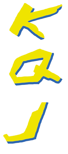
Colouring Pencil

Pencil

Adobe Photo-Shop (Shadow)
For this form of experimentation I am experimenting with adding shadows to different objects/individuals. I want to experiment with this particular area because when it comes to designing my playing cards I want to create a certain background for one of the features I intend to add to my playing cards. The background will be set with a bright moon overlooking the feature, so being able to give that feature a good shadow will really help the design be finished at a high standard. For this experimentation I am using Adobe Photo-shop and I am using a YouTube tutorial to aid me through this experimentation source. Like I mentioned earlier I really wanted to use a shadow effect in my design, but not knowing how to wouldn't benefit me at all. I think having this skill under my belt will really help with this project and projects to come. I have always wanted to learn this skill but never had the chance to learn it. However now I have I am really happy, although the work below isn't amazing it is just me getting used to this new skill. The YouTube tutorial really helped me, I remember before I briefly used the gradient tool but I never understood it. The work I tried to use the tool on wouldn't work and overall made that work look really bad. But now I have a better understanding of this particular area, it will be nice to see how I can use this skill in my final outcome. I did enjoy using this technique, throughout this experimentation week I am really trying to expand my knowledge in different areas, but I am also trying to tie everything to my idea. I liked using this technique because I have never used it before successfully so being able to use this skill whenever I please, will really help me in the future. I will most definitely use this skill for my final outcome because I will need to use it for the background I have in mind. I think if I was unable to use this skill for the background, it would mean the background would have no depth and make the design have a low finished quality.
Adobe Illustrator (Pen Tool)

My first attempt wasn't too bad I didn't think, the only thing that is noticeable straight away is that the curves are not smooth.
This means that both curves included in the Nike logo have little irregular bumps. This has happened because when I have carried on the line I obviously haven't lined them up well and due to that there are some areas in the logo that are straight and other bits are curved. So not the best start but that's what experimenting is for.
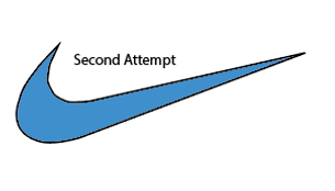
Moving onto my second attempt of the Nike logo, there is still some irregular bumps but the lower curve (the left curve) is a lot smoother. I still have some problems with the smaller curve. I am happy to say that the lower curve is how it needs to be because it shows that the experimenting is paying off and now I have completed one curve I will use the knowledge gained from that curve onto the one I have been struggling with. I think I am struggling with it because it is a much harsher curve.

Onto my third attempt, I seem to off made a break through with the irregular curves. On this attempt I zoomed in a lot more than what I did previously and I also used the direct selection tool to work on the irregular areas. I find that using the direct selection tool came in really handy. It can be used to move any part of your design. So if you went wrong in one particular area you wouldn't have to go back and delete it all, all you would have to do is use the direct selection tool to edit the part you thought went wrong.

After finishing off the Nike logo I wanted to work on another, this is all about trying new things and making sure when I go onto creating my idea I know how to do the things I want effectively. Like the Nike logo I had encountered the same issues, some of the lines have these bumps, they make it look like the lines do not match up. Although I made it sound worse than what I actually is, there was only a few little bits in the design that had these irregular lines, so this must show that the experimentation that i am doing is paying off. For my next attempt i really want to focus on getting the lines perfect and show that i am able to use the pen tool in tricky situations.

For the second attempt, things started to go in the right direction. I am happy with the top and bottom features in the design. The lines look smooth and that was one of the goals I set myself after completing the first attempt. However the main section is opposing some problems. Even though the design doesn't look like there is anything wrong with it there are still lines that don't sit right with one another. This is because of the big curve that is opposing these problems. But I am going to really focus on this area in the next attempt. Being able to complete the big curve will mean I will be used to working around small and big curves while using the pen tool.

On the final attempt I really think that this attempt has been the best so far. I went slow and took my time with each click I took. I think the key with the pen tool is to take your time because when you don't take your time, that is when the curves do not match up. That is the solution to the problem I have worked through for this logo and the Nike logo. Taking your time with things can really benefit you. I know you can't take all the time in the world but really making sure you use your time effectively can make your outcome so much better. So now I know that, when it comes to creating my final outcome for my idea I need to take everything in my stride and in my own time and do not rush it.
For this section of my experimentation I am experimenting with the pen tool on Adobe Illustrator. For my first form of experimentation I used the pen tool briefly but I was not happy with the way that this piece of work came out. So I thought what would be better than to experiment with a tool that will benefit me massively once I get to grip with it. I have always used the paintbrush tool in the past but like we all know the outlines created by that tool cannot always be straight. By using the pen tool you are almost guaranteed to get a straight outlined line. For this source of experimentation I will be using Adobe Illustrator as my material. This is because this is one of the main software's I enjoy using and also will probably be one of the software's I use to create my final outcome. That is why I find it important to learn as many tools as I can before going into creating my final outcome. For this source I used multiple research sources, I used a YouTube tutorial. This video told me the basics of the pen tool and just gave me an understanding of how to use it by myself. I also used two logos, I chose the logos very strategically. I wanted to use logos that I thought would challenge my skills and ultimately build on new skills that I have learnt in this experimentation source. This technique can be used for my idea because for some of the features I intend to use in my playing cards. I want to be able to create a background, as I see myself using Adobe Illustrator as my software I feel I need to know everything I can before starting the design process. I find knowing how to use the pen tool a vital skill, so that is the reason behind researching it and experimenting with it. I find this technique to be similar to the paint brush tool, but the main difference I have found is that the pen tool is a lot more technical. With it you are able to get the exact lines you want and by using the pen tool you are making sure there are no swirly lines that could have been added by mistake if I was to use the paint brush tool. So overall, yes I did enjoy using this technique, it was something I wanted to touch on for a long time and now I have had the opportunity to learn it, it has made me very happy as it is another skill under my belt. I will use everything I have learnt within this experimentation source, because I am always wanting to learn new things and try new things in my design. So when it comes to using the pen tool for my final outcome I will look forward to see how the design comes out.
Editing Photos (Cyberpunk theme)
Not Edited Edited


For this experimentation source, I am experimenting with editing photos to fit the Cyberpunk theme. I am doing this to get an understanding of how you can manipulate am image to fit the chosen theme you are after. I am also experimenting with this source because I have never touched on this area in Adobe Photo-shop, so I thought it would be the perfect thing for me to experiment with. I used Adobe Photo-shop as my material, I don't think I would have been able to use any other software for this particular area. For this experimentation I had to use a YouTube Tutorial because without it I wouldn't have a clue what to do. I also had to gather a photo from the internet to use for this experiment. I didn't want to use the image used in the tutorial because I wanted to see what I could do to my own image and not replicate something that has already been done. The image is located in China and I believe it is down a side street. I find the culture of all the neon signs to be very Cyberpunk themed. So being able to learn how to do that to my own images will come in very handy, I think that when it comes to my design process I could design a scene like you can see above, I would be able to use the same steps to make the design that I create Cyberpunk themed. Before attempting this tutorial I had no experience, and I never knew you could do so much with one image. When I was watching the tutorial I got a bit confused at points because the tutorial was created on an older copy of Photo-shop so some things were laid out differently. Therefore when it came to some editing steps I was unable to complete them because I couldn't find them on the version of Adobe Photo-shop I am currently running. Like I mentioned earlier I could use this technique on a design I intend to make for my final outcome. I have really tried to keep everything related to the theme of this project. Although this isn't really related to the Cyberpunk game I am adding to the playing cards, I find it still gives me something new to add to my designs. I think being able to edit photos is a massive skill and there is so much more that I am yet to learn. So hopefully if I add this to my final outcome it will boost my skill level in this area and every time I am editing photos I will be learning something new. Overall, I did enjoy learning this technique, I think when I am learning something new I find it really interesting because sometimes when you keep doing the same skill it gets overly boring. So during this experimentation week it has been really interesting and I have enjoyed learning all new skills that will hopefully benefit my work from here on in. I think I will attempt to use this for my design, I don't know how the effects would look like on an illustration form. I feel that by using this technique I have just learnt it will make my finished product look a lot better and also fit the theme of Cyberpunk a lot better to, as the design will have a lot of the Cyberpunk characteristics.
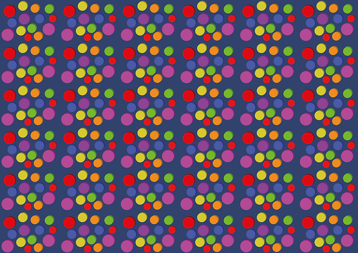
Repeated Pattern
For this experimentation source I am experimenting with repeated patterns. I am doing this because you would normally see a repeated pattern on the back side of a playing card. So being able to learn how to do this will become very vital when it comes to designing the back of my playing cards. I used Adobe illustrator to create this repeated pattern, I know that the pattern does not look the best but I thought this was only a practice and when it comes to actually using this technique in my work, that is when I will make the pattern look amazing. The research sources I used was a YouTube Tutorial. Prior to experimenting with this I have actually touched on it before. But for some reason the way to do it never really stuck, I am happy now I have completed it again. There were some parts that I remembered but overall it was nice to touch on this topic again. The reason behind choosing this to experiment on was because I have said throughout this project I want all my experiments to relate to the theme of the project. Now I have completed quite a few experiments regarding the theme I was running out of ideas of what to experiment on. But then it came to me, I was busy focusing on the front of the playing cards, I needed to do some experimenting for the back of the playing cards. This is why I decided to experiment with repeated patterns. Like I just mentioned this technique could be used for my idea when I design the back of the playing cards. My idea is to create a unique design that fits the theme of Cyberpunk. So being able to create a repeated pattern will hopefully let me create a unique design. Using a repeated pattern can also help with time planning. As we know I have planned to design a lot but not a lot of time to complete those designs. But by using a repeated pattern I am saving time as I am copying the detailed design with a click of a button instead of re-doing that detailed design over and over again. I did enjoy using this technique, the only change I would consider making would change the design I used in my experimentation. But apart from that I liked how easy the process of repeating a pattern was. The main part to remember is the measurements that you need to create a repeated pattern, without those the design could go totally wrong. I will use this technique in my final outcome but not the pattern I have created. I want to create a repeated pattern that fits the Cyberpunk theme. I need something that is going to make the playing cards stand out, and I think by using a repeated pattern I can make that desire come true.
Design Process
Front playing card border design
To get things rolling in the design process, I thought the best idea would be to create the border on the front of the playing card. This border will separate the features from the rest of the playing card. In my experimentation week I created some sketches for the border, so my task was to scan that document into Adobe Illustrator. If I am being honest I didn't really need to scan the document in but it did come in handy because all I had to do was look slightly to the right when designing the card. So once the sketch was scanned in I started to outline the card. To get the cards dimensions perfect I used the rectangular shape tool. When you are using this tool, the dimensions of the shape you are drawing come up alongside your cursor. So this made it easier for me when I needed to make sure everything was correct. Another feature that I had to make sure was dimensionally perfect was the slot for the number and letter. This will be placed at the top left of the card and the other will be the bottom left. This was also completed with the rectangle tool. My next step was curving the playing cards edges, as me all know playing cards don't have straight edges so I wanted to make sure that I include that on my own design. To curve the edges of a rectangle you need to select the direct selection tool, once this is selected you will need to hover over the corners of the shape. As a result of you doing that a circular icon will appear in each corner of the shape. This is where you click and hold on that circle icon and you can drag the corners down as far as you want. I made my corners come in by 5mm. As a result of me adding curves to the corners I was left with come excess lines, this was from the letter and number rectangle. To get rid of this you will need to select both shapes, once both shapes are selected you can use a tool called the shape builder tool. This allows you to select an area in the design, once that area is selected the tool turns that area into its own shape. So now the area has its own shape you are able to delete the area that you do not want. This is how I got the smooth edges you can see in the right image below this text. Overall, I am happy with how the design process is starting off, hopefully it stays that way and I don't run into any big problems.


After I finished the outline of the playing card it was time to move onto adding the inside features. This being the border of course, to start creating the border I thought it was important for me to add some guidelines. Without these I wouldn't have a clear indication of where I can place the border. I added the guidelines 5mm away from the edge of the playing card. This is something that I tested when I was sketching the design, and I found that 5mm works the best for what I want to achieve with the front of the playing card. There were two major things I had to think about before designing the border. One of these is the space left from the border to the edge of the playing card. If I was to add something in that area I would need enough space for people to actually see what I have designed. Another factor I had to think about was the thickness of the border, if the border is too small it might be hard to differentiate the main feature to the background I might add. If the border is too big I might not have enough room to include the feature that I want too. So moving on, the design started and to create the lines I used the straight line tool. I thought this would be the best option because if I was going to use the pen tool, or paint brush tool I couldn't promise myself that the lines would be straight. So I thought using the straight line tool would be my best option. The design started off slow because I had to make sure everything was measured out and in the right spaces. The first part of the design went well there wasn't any problems that occurred. It was only at the bottom of the design where things got a bit confusing. As you can see there is a small feature on the bottom of the design. It doesn't look hard but to match it up it was quite the challenge. So each end has to meet at the same point, but on one side of the design there are two stages, one being high and the other being lower. So the challenge was getting the higher up part to match up with the mirrored selection below. But with some trial and error I got it to look good, and after that feature was completed I was able to mirror the design onto the other side of the playing card. I simply selected all the lines I created and I held down alt and click and held onto to design. Holding down alt allows you to copy and paste the design, the only good thing is you don't have to worry about pressing ctrl c and ctrl v. Once the design was copied I wouldn't be able to slot it straight in I will have to reverse the design. So I noted down the measurements and reversed them to the design would be able to fit where I wanted it to. This was the moment of truth to see if the design fitted. Luckily it did, there was only some small movement that I needed to make, after that the first stage of the border was complete. Overall, I think the design is looking how I would want it to at this stage, my only concern is that the line might be a bit too small. But I am going to wait until I have some colour on it to see if I need to increase the stroke value of the lines.


After getting the design how I wanted it to be at this stage, it was time to add some additional features to the design. I don't know if you would be able to tell straight away but I added some addition features to the larger features in the design. So the top and bottom of the design have some additional features and the left and right of the design have some new features too. All of this has been created with the straight line tool. Another benefit of using this tool, is being able to add colour easily. To add colour to the design I selected all of the components and expanded its appearance. Once the design is expanded I am able to add colour and overall make the design look a lot better. As we know I have used blue and yellow as my design colours. This is because they are the main colours of the Cyberpunk logo. Once I went through and added colour I had a good look at the design. I felt that the design was a bit on the small side. However when I enlarged the design I felt that if I make it too big it will take away from the main feature I want to include. But without knowing that for sure I had to give it a go. As you can see below there is an image with black lines, this is the result of enlarging the stroke size for the lines I included in the design. Now the stroke size has been enlarged it has removed all the blue colour I added. But apart from that the thickness that I have gone for seems to work well with the design. I just need to figure out how to change the colour back to blue. So I thought that the best thing to do would be to expand appearance of the design. This is what you would normally do to add colour to the design. But for some reason it wasn't working, so now I have a problem on my hands. When I went and enlarged the stroke value I selected everything in the design but that is where I went wrong. When you are enlarging the stroke you are enlarging the border that surrounds the line you created. After I realised this I quickly pressed ctrl z and got rid of the lines thickness. So to stop the problem reoccurring I decided to select only the blue sections in the design. This meant that when I enlarge those areas I am able to change the surrounding colour to be blue. Therefore everything is back to what it was and the only thing that has changed is the thickness of certain areas in the design. Even though I ran into some problems, I didn't want to research the answer. I wanted to see if I was able to work around this problem by myself. I am happy to say I have been able to do that and now I know what to do if that problem ever shows itself again. Overall I like the way the design is forming and I think shortly I will be finished with this part of the playing card.


In the previous set of images I showed the problem that occurred and now you are able to see what the design looks like with that added thickness. Although it wasn't a big change I think having that added thickness really helps the design stand out. When I was looking back at the design with the smaller lines I was thinking that there would be no way this could separate the feature from the rest of the card. That is another reason why I wanted to add that extra thickness. Below there are two images and I know you are probably thinking that they look alike but in fact there is some differences. After increasing the thickness of the lines I was left with little features that stood out in the design. Overall it made the design look really unfinished and although you cannot spot these mistakes from afar if I was ever to print the playing cards, you would be able to see them straight away. Below I have included photos of these small features, to fix them I used the direct selection tool to re-adjust all the lines that I enlarged. This took some time but after it was completed this made the design look a lot better. After looking at the design I am happy that I went for the enlargement in the lines, I think it helps make the border stand out. Before you would struggle to see the border and I can only imagine how much you would struggle when the feature is included with it. So once all the adjustments were made I think it is time to say that this concludes the design process for the border. I found it fun to design and I think having completed those sketches in my experimental week really helped with the design process. If I didn't complete any sketches I think I would have spent a lot of time thinking of an idea, and without seeing that idea. There might have been a chance I didn't like it and as a result that would really damage the time I spent on this area. Finally, I think that the design I have created will work really well for the final outcome. If I was to do this section of the design process again, although I couldn't see the problem coming I think I would try and be more aware of potential problems like that happening. But apart from that there wouldn't be much else to change. I think I managed my time well and going forward I would like to keep good time management with all the designs. processes i complete.


Letter and Number Design
To start this design process, I decided to have a look back at the sketches I created in the experimentation week. Once I got a feel for the design I was creating I knew it was time to load up Adobe Illustrator and start the design process. I started off by outlining the text, I have the letters K, Q and J. The K stands for King, the Q stands for Queen and the J stands for Jacks. As we know having a clear and bold letter helps players know what cards they have in their hand.
I used the pen tool to create the outlines of the letters, I found that the experiments helped me a lot at this stage in the design process. This was because with the sketches I knew exactly what I wanted to do and how I was going to do it. Once the outlines were created I went onto adding some colour to the letters. I decided to follow the Cyberpunk theme and use yellow and blue as my main colours. There were some problems that occurred when filling in the letters. One of the problems was when I was filling in the letter Q. As you can see there is a blank space in the middle of the Q, but when I filled the letter in, that space was filled with the same colour yellow. To resolve this issue I had to undo the colour filling and select the letter as a whole. Once the letter was selected as a whole it meant I could use the expand appearance option found in the object tab. The expand appearance option makes it possible to use the live paint bucket tool to fill in any shape you may of created. So instead of filling in the whole Q, I clicked on the outside edge of the letter and that resulted in the middle of the letter to be left blank. So it was a silly mistake on my own behalf, and I will now know what to do if that problem ever occurred again. Once all the letters were filled in with colour it was time to add some shadow effects. The shadow effect adds depth to the design and makes the letters stand out more. As you can see below the images show the letters without the shadow effect and I think they look dull and boring, but with the shadow effect it makes them carry completely different characteristics. To create the shadow effect I used the pen tool, the only tricky part was knowing where to place the shadow. Once the outlines of the shadows were completed I selected each letter individually and expanded their appearances. This is the same step that I took when I had to fill in the letter Q, only this time it was to fill in the shadow features. Like I mentioned earlier, I followed the same colour way from the Cyberpunk logo, because I used yellow as the main colour it only left me one choice and that was to use the colour blue as the shadow colour. When filling in the added features I didn't run into any problems, there were only some areas that needed some adjustments. What I mean by adjustments is that in some areas in the letters the shadow effect didn't quite line up with the rest of the letter. So to make sure the finished product of the letters is high quality, I had to make sure everything lines up perfectly. Now the touch ups have been added, it is time to conclude the letters design process. Overall, I am very happy with how they came out and I feel that the experimental sketches that I drew really helped me out. The sketches enabled me to see what the design would look like and if any changes were to be made I would be able to do it on the sketches and not waste time on editing them when I am designing them for my finished product.


After finishing off the letters for the playing cards, it was time to create the numbers. The first steps to create the numbers were to create an outline. Before even starting I know that creating the numbers was going to be quite the challenge. As you can see they have small curves and I still find myself to be quite new to using the Pen tool. On the other side using the Pen tool in this situation can be very beneficial. As you know for some of my experiments I experimented with the Pen tool, I thought that I was getting quite good at using it and creating the numbers will really show how I am doing. The first two numbers went well and I got to three, this was where I struggled a bit. Due to the tight curves in the number it made it difficult to get everything spot on. So a few attempts went by and I felt that I must not be doing something right. But this is where I learnt something new, to create a good curve the best thing to do is to follow the lines of your shape. So for example you have a curved edge on a rectangle. You would click at the start of the curve then you would click and hold at the end of the curve. I know your probably wondering, that the line I just created would be straight but by clicking and holding you can bend that line to fit the curve that you want. So to get a good curve I would locate my mouse further down the side of the curve end. Hopefully you will find the right join and the curve you have created will be smooth. Hopefully I explained that well, and that is how I got better with the curves that I was creating in the numbers. Once all the outlines were completed I moved onto filling the numbers. Like the letters, I individually
selected the numbers and expanded their appearance. This meant that I could use the live paint bucket tool to fill them in with colour. After going one by one and filling all the numbers in it was time to add some shade to the design. There was an important rule I had to follow and that was adding the shadow at the same spot as I did for the letters. Therefore when the playing cards are grouped together they don't look different in any way. I followed the same steps as the letters, but I knew adding shadows to some numbers was going to be difficult. So I tried some new approaches to adding shadow to the numbers. The shadow effect was added to the numbers with the straight lines by using the pen tool. But for the curved numbers I tried something different. Instead of adding additional lines myself I thought why don't I use the original shape but move it around a bit. So going off that idea I held down alt and dragged the number away from its original placement. Now it was time to add a different colour to the copied number, so of course I changed it to blue. There was one step I had to make before I could add the copied number back to the original number and that was sending the copied number behind the original one. In other words moving the copied number to a layer below the original number. This meant that I could then add a shadow effect and not worry about if everything is the same size. The only change I had to make was enlarging the copied number, this was to make sure that you could actually see the blue coloured number. Overall I found that both methods of adding shadow was effect but copying the number and placing it below the original number was a lot more time effective. Now both the number and letters have been completed, it means that this part of the design process has to be concluded. Although this has been a small design process, I have for sure learnt a lot. The main improvement I found is using the Pen tool. I feel a lot more comfortable with it and going forward I feel that being more confident will make me attempt more adventurous designs.


Locations
To start this part of the design process, I decided to choose a photo out of the ones I collected for my research. I decided to go for the No-Tell Motel location, this was because I thought that the image already had a good amount of LEDS, so being able to enhance those features will be able to make the image look a lot better. The first thing I did was open the image in a Adobe Photo-shop document, I also had the Cyberpunk editing tutorial open too. This was the same tutorial I used in the experimentation week, I was very happy that I decided to use the tutorial as one of my experiments because if I didn't I wouldn't know how to add the effects to the image and they would have not changed from the original photo. The images would look dull and boring, this tutorial enables me to enhance the LEDs and make the image pop out of the page. I also created a short time lapse of how I created the edited photo, I screen recorded this with Microsoft PowerPoint and created the time lapse on Adobe Premiere Pro. I am no stranger to creating a time lapse, so throughout the creation of the time lapse I didn't really run into any problems. The images below show the same location but the effects within the image are a lot different. The image on the left hand side is the photo un-edited and the image on the right is the image edited with the Cyberpunk tutorial. Looking back at the image I edited for the experimentation task, I can see a big improvement in the way the image has concluded. I feel that the image created in the experimentation week was obviously my first time attempting editing a photo, so it isn't going to be perfect. But looking at the image below I feel that I have really come on since the last time I attempted this tutorial. As you can see everything in the image has been enhanced, brighter lights, enhanced colour and overall a better looking photo. Before this part in the design process I have been completing the necessary stepping stones to create the fully designed cards, so I am finding it really fun to start including the proper features in the design. I think for those who have played the game, they will be able to get a lot out of the playing cards, they will be able to relate in a way. When they are playing they might pull out a card that has a location on and think to themselves I have been here in the game, so every time they are pulling out a card they are interacting with it and relating to all the images they see. My next steps will be adding the edited image to the Playing card border, I designed not to long ago. I also need to think of a way I can lay out the design, so creating a sketch will really help me out.
Not Edited

Edited


After finishing off the edited photos and creating the time lapse it was time to move onto adding the photo onto the playing cards. The first thing that I decided to do was create a sketch for the design, this was something that enabled me to see the layout of my idea in a playing card format. The sketch is very rough but gives me a good template to use for when it comes to designing this suite of cards. Once the sketch was completed I thought it would be best to create the font I intend to add to the design. Earlier on in the design process I designed the letters and numbers for the playing cards, so using that knowledge I created the name of the location in the same font. I think adding the name of the location will come in handy for each playing card. This is because in some locations the name of place isn't included and also like the location I have used, the name of the location is sometimes cut out and this is because of the tight dimensions of the playing card. So I started off by creating an outline for the text, this was created by using the pen tool. This was an area that I struggled with in the past but now I have used it more and more I have really got to like using the tool. Once the outline was created I added some colour. Like the last text I created some of the letters went wrong. In particular the letter o and e. When I went to fill in the letter the space in the middle which is meant to be blank, gets filled in. So to move on from this issue, I grouped the two shapes and expanded their appearance. If you are wondering why I said about two shapes, that is because the outline of the letter and the inner outline of the blank space are separate from one another. So by grouping the object, it makes it easier to fill in the letter with colour after I have expanded it. I used the live paint bucket tool to fill in the letter and once all of the letters were filled it, it was time to add the blue shadow effect. Previously I have completed this technique and I tried two ways of completing it. One by drawing the shaded area on with the pen tool and the other was copy and pasting the letter and changing that copied letter to the shadow blue. The one I decided to go for was the copy and paste technique, I found that this technique was a lot more time efficient and enabled me to move onto the next step a lot faster than I would have been able to if I used the other technique. Once the text was created it was time to add the location image to the playing card. I started by getting the image placed where I want it, I had some trouble on this part of the design process. The trouble was me making a simple mistake, I added the PNG image onto the Adobe illustrator file and I thought I would be able to use the eraser tool to get rid of the excess image. But unfortunately, I was wrong and you are not able to do what I thought you could. To fix this problem I got rid of the image in illustrator and I exported the playing card with the border outline. Once that was exported I loaded it onto a Photo-shop file and then I was able to add the PNG of the location. Now the two images were in the same place I was able to erase the image accordingly to the border outline on the playing card. Once everything was lined up perfectly I moved the location image back over to the Illustrator file and then I was able to line everything up. Now I have one playing card nearly completed, the only part missing was the title of the location. So I quickly added this to the playing card and found a good place for it to be placed. Once that was placed, it meant that this playing card was complete and I am able to start on creating the other playing cards in this suite. Due to process of creating being the same for every card in this suite I am not going to document it as all I would be doing is repeating myself. If I run into any problems I will be sure to add it but apart from that the next move I make will be creating the rest of the cards in the suit.
Once the first location card was complete it was time to move on creating the rest. Like I mentioned above the creation process of this suite of playing cards will be the same, so there would be no point in documenting every location card I make. So what I thought would be best would be showing what all the cards look like finished, and how I have added a few things, which in my opinion make the cards look a lot better. The first piece of work I got on with was finishing off the playing cards, I followed the same tutorial on each image and also added the same font for each image included. This was a long process but after seeing them all completed it makes me very happy. I wasn't sure how the idea would look like for all the cards in the suit, but now they are all completed I can see that the idea that I went for really works well and has made my idea into a reality. Once all the cards were completed, I thought to myself that I cannot leave the cards with the white outside edge, I felt that it didn't really fit in with the theme I was going for. So I thought the perfect colour for the outside edge was black, I thought that it would allow the border colours to pop and overall really make the features stand out. Everything was going swimmingly up to this point, it was only until I filled the playing cards in that a problem arose. When I filled the playing card in there was a white strip laying along the top left side of the playing card. Maybe I did something I didn't mean to do back when I was creating the playing card outline and it has resulted in me having this white strip along the playing card. My first thought was to edit the shape but for some reason that method was not working. I used the direct selection tool and edited the edges of the playing card, I thought that that might be the solution. But all that was doing was making the curve uneven and overall degrading the look of the design. So I thought of the next best thing and that was to add another shape that would overlap the original shape. This resolved the issue and to make the shape one piece again I grouped the new shape with the existing playing card. Once everything was back to how it should have been, it was time to add the location images back onto the playing card. This meant that it was time to finally see what the playing cards looked like with the black outside edge. I think overall it drastically changed the look of the playing cards, and compared to the white outside edge it has made the design look a hundred times better. I am happy that I went for the colour black, because I needed a
colour to contrast well with the yellow and blue included in the
outline. I also had to think that the location images would have
a wide range of colours so including a nice slick colour for the
outside edge really helped every single feature in the design
stand out. I know your probably thinking that the cards are not
complete and they do not have their numbers, letters and
spades icon but that is to come. My idea is to complete every
design first then include those small features, I don't want to
include adding those features every time I completed a suit
because all I would be doing is repeating myself over and over
again. So including them all together in one place would make
a lot more sense. Now everything is completed it concludes
this part of the design process, I am happy with how everything
is going so far. Everything seems to be on track and all the
outcomes I am producing are exactly how I wanted them too
be. Although some problems may occur, I try and face them
straight on. This means that when a problem arises I will
combat that problem straight away and if I don't know how
to fix the problem myself I can always turn to the internet or
fellow class mates.


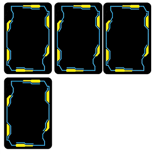


Guns
To start the gun design process, I started brain storming some ideas for what I could do. I decided the best thing to do would be to create a sketch of the idea I had in mind. The idea was to create a symmetric line design, this idea was either going to work really well or not work at all. Once the sketch was finished I looked back over at it and realised that I didn't have enough space to put the name of the gun anywhere on the design. So I decided the best thing to do was to start designing on Adobe Illustrator. I started off by creating 3 lines identical to each other and placed them on either side of the playing card. I'm trying to create it to so matter what way you look at the card the design always looks the correct way round. The design and sketch so far have stayed the same but after looking back at the sketch I realised how busy the sketch actually looked. So after making some changes I decided to just start designing. I had no idea in mind, the only rule I stuck too was making sure that the design was symmetric. I also had to account for the space needed for the text I planned to include. The text will display the name of the gun and it will be in the Cyberpunk font. The design started to look good, I ventured into the middle of the playing card, and so far the design isn't looking too busy. Once I completed filling in the middle section of the design I started to think that if I was to go any more I would be going in the same direction as I did for the sketch. So I decided to stop there and add the gun to the design, as soon as I added the gun I knew this design wasn't for me. I think the design didn't look right, with a design everything should tie together but I felt that this design just looked random. I also found that the background was capturing your eye more than the actual main feature of the playing card. In some situations that might work but for me I wanted to make sure that the main feature of the playing card was the gun. After much assessment of the design I have created I think the best thing to do would be to think of a new design. I found with the design you can see below there is
too much going on and for me I really want to make sure
that the gun is the main centre point of the design. For the
next step I will think of some new techniques that I am able
to use to create the background. This time I will try and
make the design a bit more simplistic and hopefully due to
the design being more simplistic I will be able to achieve
what I wanted too and that is making the gun stand out
more than the background.


Once I realised that I needed to think of a new idea, I instantly thought about doing a gradient, this idea creates something simple and hopefully it will suit the rest of the design on the playing cards. To start creating the gradient I had to create an outline of the border, this was done by using the pen tool. I then selected the whole shape, this is the one I just created with the pen tool. Once the whole shape was highlighted I was able to use the gradient tool to create the gradient you can see below this piece of text. The gradient starts with white and black but of course you can change it to be any colour you like. So my next decision I made was what colours I thought would best suit the rest of the design. So I started with a dark orange going into a lighter orange, I thought this didn't look too bad but I thought that it didn't really fit in with the Cyberpunk theme. My next colour combination was a dark green and a lighter green, so far this was my favourite outcome, I thought that it contrasted well with the colours on the border and I think this could be a contender for the colour combination I use for the rest of the cards. The final colour combination I attempted was a dark blue transitioning into a lighter blue. There was a concern with this colour because I thought that it would clash really badly with the border colour. But after seeing them next to each other there was no real issue with using a blue gradient, if I am being totally honest I think the blue gradient really highlights the lighter blue I used on the border. My next step was deciding what colour combination I wanted to go for, this was a tough decision to make because there was two colours that I really liked, and they were the blue and green combinations. After much deliberation I decided to go for the blue gradient, this was because I thought it really expressed the outline colours and hopefully it will make the gun the centre point of the playing card. Now I have the colour decided it is time to see what the gun looks like partnered with the background gradient. The previous background really didn't benefit the gun in any way but now with the new background you can clearly see what the gun is and to be honest I really think the gun is the centre point of the design. When you look at it you are straight away drawn to the gun and that was the main achievement I wanted to accomplish with this new background. After adding the gun to the background, it was time to add some text to the bottom of the playing card. I used the letters from earlier on in the design process to build the text. The name of the gun was Crusher, so of course I had to create that word on the Cyberpunk font I created. With the prior knowledge of creating the words I was able to create the word crusher quite fast and didn't really run into any main problems. Now the gun, background and text has been added that finishes off one playing card for this suit. Overall, this part of the design process went really well, I like the fact that I didn't like the last background design because it enables me to create something better than the last design. So in some ways creating something that you do not like can be a blessing in a disguise. I thought that I used my time effectively and I look forward to seeing what the design looks like once all the cards in the suit are completed. I will obviously not evidence every single card I make because I would be talking about the same thing over and over again. So once all the cards are complete I will place them below this piece of text, and if there are any problems I will make sure to highlight them next to the photo of the finished playing cards.


After completing the first card in the suit, it was time to move on and complete the rest. The first step I took was copying over all the backgrounds onto the other cards. I used the alt and drag method to copy each design onto the next set of cards. This method is very effective and is time efficient. Now all the cards had background it was time to add each gun one by one. I thought to myself what would be the most time efficient way off adding all the guns and the text. So I thought that I should add all the guns first, then move onto adding the text. I found that the method I just spoke about works really well and I found that adding everything to the cards didn't take long at all. Compared to the last suit of cards, the text was a bit different. This was because I had to include numbers into the text, luckily I am designing playing cards so I had the numbers already made. The tricky part was adding them to the text, I found that when I added the numbers to the text, the numbers looked out of place. So after a bit of playing around I got the numbers exactly where I wanted them to be. Throughout this part of the design process I didn't really run into any problems, I think I am aware of most problems that could happen and I am putting in the necessary plans to stop those problems occurring. I also think that because each suit of cards are quite similar I am learning more and more each time I complete a suit. So hopefully the final suit should go swimmingly as I would have all 3 prior suits as experience. Finally, I also found it important to learn from the problems that I face, then I am making sure that those problems don't happen again. After finishing adding all the features onto the playing cards, I think it is time to assess the outcome. I think that the cards came out good, they were not quite what I had in mind. Before starting this part of the design process I had my mind set on a symmetric design for the background, but it is clear to see that not everything goes the way you planned it. I was happy that I found out early on in this part of the design process that I didn't like the symmetric design, because I was quickly able to change what the background looked like and resume the design process. So in summary I am happy with how this suit came out, I think if I was to do it again I would add some additional features to the background, just to add a bit more of a WOW factor. But apart from that I wouldn't change a thing. Also, I know you are probably thinking that there are no numbers, letters and suit icons. But like I explained at the end of the last suit I am going to add that all in one go after I complete all the suits.


Vehicles
To start this part of the design process, I thought it would be best to sketch out some ideas I had in mind for this suit of playing cards. This suit is obviously all about the cars within the game, so making them look good when on the playing card will be the biggest challenge. On the sketch I forgot to mention what orientation I am going to have the cars, they are going to be placed vertically, so when you look at the playing cards from the right hand side, the car will be the right way round. I thought this would be best because then I am able to fit the car as a whole and not worry about squishing the car to fit the horizontal layout. I was also thinking about where to place the text, either at the bottom of the playing card or the right hand side of the car. If I place them on the right hand side it will be placed right under the car, which could potentially look good. For the car image I wanted to do a similar effect to the location images, but I thought there would be no point in using the same one because I am not learning anything new. So I went onto YouTube and found the video you can see below. The start of the video was more or less the same as the last but it was only at the last bit of the video where things got a bit different. Near the end of the video I was able to learn how to create an effective fog effect with the paint brush tool and also how to create a wider spread fog effect with the filter tab. Both of those skills I have never completed before so it was really interesting to see how it worked. I found that it wasn't that hard to complete but I still think there is so much more to learn regarding that simple skill. Below this piece of text you will be able to see two videos, one is a YouTube video and the other is my own time lapse, in the time lapse it shows me adding the effect to one of the car images. The screen recording was made with Microsoft PowerPoint and I used Adobe Premiere Pro to create the time lapse. Creating this wasn't that hard, I think because I have completed that process so many times now, I feel very confident in that area. Once the time lapse was complete it was time to assess what the edit did to the photo. As you can see the edit has brought out the blues in the photo and overall I think it has made the image look a lot better. Sometimes I see edited photos and I think the edit has been taken to far and it makes the image not look realistic. What I found so interesting about this outcome is that even though the tutorial was made for a busy lit up street I was still able to add it to the car images. When I'm thinking about it, if I was to complete this part of the design process again I would consider adding some extra details in the background of the image. At the start of this section I was considering adding some neon lights to the car but then I thought against that idea because the cars that are
included are meant to be the ones from the game. So if I was
to change the look of the car I would be changing the perception
given from the cars' look. If players were to use my playing cards
before they play the actual game, they might think that the cars
included on my playing cards with the neon effects would be
what they look like in the game and when they play the game
they might be disappointed. So that's why I thought it was
important for me to leave the cars alone.
My next steps in this design process was to start adding the
image to the playing card template and also create some text
to go along with the image.

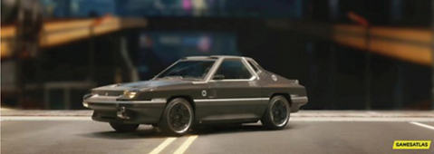

After finishing off editing the car photo it was time to get it prepped and get it added to the playing card templates. The first thing I did was get the original template of the border loaded on up Adobe Photo-shop, this is where I have been editing the photos so far. Once the border was added I selected the eraser tool and started carefully moulding the car image to fit the template. I did this one Adobe Photo-shop because when it comes to adding it to Adobe illustrator I only need to make the image fit the outline and overall I think doing it in this way makes it a lot more time effective. So once the image has been cropped to fit the outline on Adobe Photo-shop, it was time to remove the border and export the car image as a PNG. Once the image was exported it was time to add it to the Adobe illustrator document. So I created a new layer and placed the image in. It only took a little alignment and the image was in the correct position. Now the image was in the right position it was time to build the text, the text will display the name of the car. To get the text made I went onto another Illustrator document, this was the one I used at the start of the design process to create all the numbers and letters. So letter by letter I went, creating the word, as we know I start by creating the outline, then fill the outline in with the colour yellow. Once the letter is solid yellow I hold down alt and hold my mouse button on that letter, then I drag the letter away and that makes me a copy of the yellow letter. So now I have two yellow letters, this is where we change one of the letters to a blue and use that as a shadow effect. So once each letter is complete I am able to create the word and after that is complete I am able to add it to the original Adobe illustrator document, which has all the playing cards on. This process can been see further up the page, each time I create a card I aim to add some text saying what it is. At the start of this part, I mentioned that I was a bit indecisive as to where I wanted to place the text. But I thought that the best place for it would be the bottom of the playing card. This is because I want all the cards to have some resemblance. Of course everything is the same apart from the images and how the images are orientated. So I thought I best stick to the pattern and keep everything the same including where I place the text. Overall I think that decision will benefit the look of the design, because I think it would look odd if the text was in a different position for one suit. I want to keep as much as I can the same in the card design because when you see playing cards most of the cards are the same, the only difference is the suit that they are in. So thinking about that I wanted to make the best set of cards I possible can, so making that decision is probably the best thing for the cards. Now the cards are complete it is time to create the rest of them, I am not going to include the process for each card because I would be just repeating myself, so if I have any problems I will document it and also I will show the final outcome of this suit.


After finishing off the first card in the suit, it was time to work on the rest, the game plan this time was to edit all the photos first and then add them to the templates. So off I went one by one editing the photos, after I finished with the editing I added in the border template and erased the excess image. This was the tricky part of the design because most of the images came up short from the border. What I mean for this is that because the cars are quite close to the camera, it makes it hard to decrease the size of the image and also fill the gap of the border. To resolve this issue, I used my alt and hold of the mouse method to copy the image. Once the image has been copied I used the eraser tool to trim the image down so that the only part of the image left is the road. So now the road is left I am able to match it up to the road on the image and this will make the image look like it fits the border frame. For each image I had to do this process about 3 times, but once they were all complete I thought they looked really good. I was worried when the problems arose because I didn't want to stretch the design, and that would result in the image looking uneven and ultimately look bad. Another concern I had was making the additional parts of the road fit the design, you could think that what I am doing is a small form of matt painting. I am getting multiple images and making them look like they are one. Some of the images it is easier to see what I have done but in most of them I have tried to hide it the best I can. Now all the cards are complete I am able to conclude this part of the design process, of course I still have to add the numbers, letters and suit icons. But everything is looking good. I am getting closer and closer to finishing this project, the only parts I have left is the back design and also completing the final suit. To think how everything has just come from an idea and now everything is nearly complete. It makes me so happy to see it all coming together and I can't wait for that feeling when I see them all together and I am able to play with them.


Characters
Moving onto the final suit in the pack, the first thing I did was create a rough sketch for the design I wanted to create. I planned to have the characters name in Cyberpunk font at the bottom of the card, I also would like to create another gradient background, but this time make it different and I also want to place the characters in the centre of the playing card. Now I have the idea in my head of what I wanted to do it was time to get designing. To start the design stage I loaded up my playing card template, I used this to create an outline of the border, this outline will make it possible for me to create a gradient background. Once I gathered the border outline I loaded up another Adobe illustrator document and got to work creating the background. Now the outline has been transferred over, I am able to select the gradient tool and once I have it selected I am able to click on the border outline. This adds a black to white gradient within the border outline, you will be able to see what I mean below this piece of text. To add different gradients, you will need a little pop up tab. To get this pop up tab you should click on the fill icon on the right of your screen and a tab should pop up where there is loads of different colours. If you have this up there will be a little clickable box located at the bottom right of this new tab, this clickable box will be called gradient options. You should click on this and now you have the gradient settings and with this you can change the way your gradient looks and also what colours are included on the gradient. I have used a gradient before so of course I didn't want to copy the same one I did last time, so I decided to go for something different. So as you can see below I first looked at a straight gradient and then I went onto a circular gradient. I decided to go for this gradient because I thought it was important for me to show a diverse look at all the gradients you can use and I think I will be able to make a really unique gradient. With the creation of the last gradient I didn't really mess around with it much so I thought this time I am going to learn some new things regrading the gradient tool. So when I made the gradient a circle a big white and black border appeared, this is something that you can use to change the size of the gradient. So I spent some time playing around with this and I got the gradient sized exactly how I wanted it to be. Now I was done playing around with the gradient settings it was time to mess around with some colours. For this part I had to think about what would best suit the colours used on the playing card. I would need a colour that combines well with all the features included on the playing card. The first colour I went for was a grey scale, not too sure on this one. I think having a grey scale doesn't bring much warmth to the playing card and as a result I don't think I will be including that on my design. The next colour I decided to go for was an orange and a red, this was two possible colours to include as my background but there was still something that I didn't feel was right. I think due to there being no bright colours for the backgrounds in the last 3 suits it would be weird for me to include this on the final suit. I also think this background couldn't work because if you think of it from a players perspective, if you see these bright colours on a players card you are going to know straight away that, that card belongs to Diamonds. So after thinking about some colours I thought could work, I decided to go for a blue scale. This was like the colour I used in the previous gradient but in some ways it was different. Now I have selected the colour it was time to add it to the playing cards and also the important step of seeing if the text and characters compare nicely to the new background.


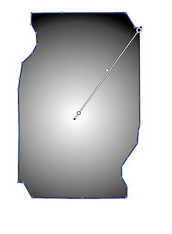


Like I mentioned in the previous part, I will be adding the new gradient background to the playing card design. So of course the first thing I did in this part of the design process was copy the gradient background back onto the template option. Now the background was back on the template document it was time to see how the background paired with the border. This was a worrying time because we know I included a blue border colour so including a different shade of blue could either turn out good or really bad. It was the moment of the truth, the background was added to the design and overall I think I was worrying too much. The colour used in the gradient contrasts well with the blue I included on the border design. In some ways the colour I included on the gradient makes the colours on the border stand out more. The next concern is seeing how the design fits with the added text and also character images. So I decided to add a character first, there is always a worry when adding a PNG photo of a character because you want to make sure that the image doesn't look out of place. Really you want to make sure all the images included look like they are meant to be there. So after thinking about the problems that could occur I thought it was time to add the character and luckily the character that I included fits in well with the background. I just have to hope that all the other characters I include fit as nice as this character. Now the character has been assessed it was time to add the text to the card. The text was made with the same Cyberpunk font as I have been doing for the whole set of cards. So creating the text for this card wasn't that hard. Now I am getting closer to the end of the project I haven't really had to make any more letters, I have been able to use all the letters I have made previously to create the characters name. Once the name was complete it was time to add it to the playing card, I thought it would be best to continue where I place the text and that is on the bottom of the playing card. This was another important time because I had another blue colour on the text so seeing if it contrasted well with the back ground was very important. I think that the contrast between the two blues work really well and I am happy that I decided to go for that colour. Now the first card has been complete it is time to complete the rest of them. Like I have mentioned for all the previous suits, all I am going to show is the finished product and also I will mention any problems that I may have encountered. So far I am happy with the way the cards are progressing and I think if I was to do this part of the design process again I would consider making a more detailed background, something that would make the character slot straight into.
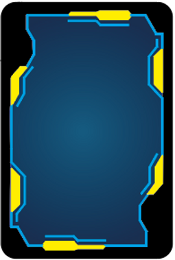


After finishing the first card in the suit it was time to start the process of creating all the other cards. The images I used for the characters were the ones I gathered when conducting my research. The hard part was that some of the images didn't show the character standing up all they had was part of the character. So some of the characters that I intended to use didn't actually get used. This was the longest part of the design process because I had to go and find another set of images that show the character standing up. There is still one character that I couldn't find a full image off but I still wanted to include her because I thought she was quite important to have. She is one of the main characters that you embark on different journeys with so I thought I couldn't not include her. Each other character that I included has some significant roles to play in the Cyberpunk game and that is how I made my decision on who to include. There were hundreds of different characters that I could choose from. But if I just included a random character players would be confused as to who they are. That is another important factor that I wanted to include with the playing cards, I want the players to be able to interact with them. I want them to see a playing card and think I know exactly what feature that is. It is also fun when you get your favourite character when playing a game of cards, well I know I do. So since the start of the creating the cards I have always wanted to make them pop with enjoyment for the players, it also shows the interactive value of each card. If each card has an important feature on players will try there hardest to get those certain cards. So in some way you can still play card games but you can also see what characters you are able to obtain when you are playing those games. My next move will be adding the numbers, letters and icons. Once I see those features on the cards I know everything will be nearly complete. When those features are placed on the card, it will complete the suits and all I have left to do is design a back design and possible design the Jokers that come along with a set of playing cards. Overall I am very happy with how the cards have turned out, for some of the characters, the image I have chosen has resulted in them looking a bit grainy. But I quite like that look because I feel it gives the cards a retro feel and that is the feel I get when I think of Cyberpunk.


Adding Numbers, Letters and Suit Icon
Location Suit ( Spades )
To start this part of the design process I gathered the pre made numbers and letters and placed them on the top left of each playing card. To make sure that they were all aligned I created a rectangle from a corner of the border to the bottom of each number and letter. This can be seen on one of he images below this piece of text, the rectangle is 11.171 mm in height. This gave me the perfect space to place the number and letters and also gave me enough space to add the spade icon. This step was quite the worry because I didn't want to make the numbers too big and I didn't want to make them too small either. Finding the perfect size was quite the challenge but we eventually got there. To make the numbers fit perfectly I decided to make them have an equal height of 7.239mm. Therefore each letter and number I include will be aligned perfectly, the design would look awful if I had one number one size and another number a different size. So choosing a good height was necessary to make the cards look good. Once all the numbers and letters were added to the top left of the design it was time to mirror over these features onto the bottom right of the design. This was quite the challenge to mirror the letters and numbers over because there was a lot of factors I had to think about. The main factor was making the numbers and letters mirror perfectly. To start the mirror process I used the same rectangle I created for the alignment for the top left of the design and placed it in the same position on the bottom right of the design. This meant that when it comes to me mirroring the features I know exactly where to place them. When mirroring each feature I had to remember the height and width. So my process was flipping the feature vertically first and making sure that the height was 7.239mm and then I flipped it horizontally and I also had to make sure that the width was the same as before. So once both of those measurements were added correctly it was time to add the feature to the bottom right of the design. Having the rectangle was a big help because I knew exactly where to place the mirrored featured. I went through the same process 13 times, and each time I had to make sure the placement of each feature was perfect. Otherwise it might result in the design looking bad and off balanced. When you see a playing card, everything is lined up perfectly. So my big aim was to reciprocate that on my own design. After I finished mirroring all the features it was time to assess the work I had completed so far. After assessing it for a while I was happy to say that everything was lined up and there were no issues regarding the position of any features. My next move in this process will be creating the spade icon and also adding that icon to the design. My only worry is that I haven't left enough room but there is only one way to find out and that is to add it to my design. I can always make some changes if need be but I'm hoping I won't have to.

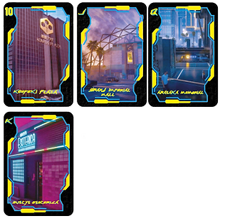


After finishing adding the numbers and letters to the design it was time to create the spade icon. I started off by creating a outline of a spade, once the outline was complete I moved onto filling that outline in. Following the Cyberpunk theme the colour I used to fill in was yellow and I think you can guess what is coming next. It is time to add the blue shadow. Adding the shadow was fairly easy, it helps that I have done it soo many times now. All I did was hold down alt on the original spade icon and still holding down alt I moved the mouse key away from the icon and let go of the mouse button. This resulted in a copy of the spade icon appearing and I would be able to change the colour of the copied spade and use it as my shadow effect. When carrying out that method it is important to not let go of alt before you have let go of your mouse button. This is because the method will not work if you let go of the mouse button before alt, ultimately nothing will be copied. Once I created my spade icon it was time to add it to my design, this is where the rectangles make an appearance again. I used the same corner of the border from the previous step as a point of knowing where to place the spade icon. As you can see below I have the previous steps rectangle measurement and I have the spades rectangle measurement. For the spade I measured 2mm from the corner, 1.355mm from the bottom of the number or letter and I measured 1.869 from the right hand side of the border. This made a perfect placement for the spade to fit and this was carried out on all the other cards. Like the previous step I filled in the top left of the design first and once that was completed I moved onto mirroring the spade. Having these rectangles really helped with knowing where to place the spade once it was mirrored. From mirroring the numbers and letters I learnt that the most important factor was keeping the same height and width of the object you want to mirror. Preferably I would write down these factors on a piece of paper beside you or on the document you are working on. Therefore you are making sure that the spades dimensions are exactly the same as they would of been originally. Once all the spades were mirrored onto the opposite side of the playing card it was time to assess my work. Seeing this suite completed really motivates me to keep working at the same standard that I am. Before starting the suit I was worried that I set myself too much to do, and yes maybe I have but seeing everything completed really makes me want to make sure everything gets completed on time. I also think that the cards came out really good, if I was to complete the process again I would consider changing the way I measure out the placement for each feature. I could possible use guides to measure out the placement. But apart from that I think everything that I have completed in this design process so far has came out how I imagined it to and in some ways it has come out better. For each suit I complete I will document how I create the specific icon and what the completed cards for each suit look like, but apart from that if I was to document the process of adding the icons to each suit all I would be doing is repeating myself and I don't see much point in doing that.


Gun Suit ( Clubs )
Like I have explained above, all I am going to show is the final outcome and the process of making the suit out come. This is because if I was to show you everything I did, all I would be doing is repeating myself. So to start this part of the design process I created the clubs icon, I started by creating an outline for the icon, this was made with the pen tool. I then moved onto expanding the outlines appearance, this means that once the outline is expanded I am able to fill it in with colour. So of course I had to fill the first outline in with yellow, as that is one of my main colours. The next step was copying and pasted the filled in icon, this means that once the icon is copied I will be able to change the colour to blue and add the shadow effect. Once that was all completed it was time to add it to the playing cards, the numbers have already been placed because I used the template I created on the last design process step. To add the club icon to the cards I used the same technique as I did for the last design process step and that was changing the height of the outcome to 7.816 and I also created a rectangle shape with the height of 2 mm again. This rectangle will be placed in the exact position on the last design step, therefore I am making sure for each suit I make all the icons are in the same position. So one by one I went adding the icons to the cards and this time it went quite fast. I think I was lucky to have created the numbers on the last step so that was another worry gone and I was also lucky that I found such an effective method. So once all the icons were added, the cards were complete. Overall, I think looking at them all complete really excites me because I know I am one step closer to seeing all these cards together and have them all completed. I think so far I have expanded on my knowledge of some skills. When I think back to when I was experimenting with the pen tool and to be honest those outcomes were not the best. But now I am able to make smooth lines and really make the design I am going for come alive.


Cars Suit ( Hearts )
This is the final part of creating the heart suit, I have created the heart icon and I also placed them where they needed to be on the playing cards. To start with I created an outline for the heart icon, this was done by the pen tool. Like I have mentioned before I really feel that I am getting to grips with the pen tool and even on something like this, which is majority curvy. I feel that the finished outline has come out really good . The next steps was to fill in the outline and I filled in the outline with the same yellow as I have done for all the previous pieces of work. After the outline was filled it was time to do my copy and paste method to create a copied version of the filled in heart. Once the filled in heart was copied I was able to change the colour of it to the shadow blue and I would then go onto placing it in the correct position. Once the heart icon was created it was time to add it to the playing cards, I made the heart icon have the same height as the rest of the icons and that height was 7.816mm. Changing the height resulted in the heart icon looking really flat so I had to quickly change that. Now everything was correctly measured it was time to find the correct placement for the heart on the playing card. I used the rectangle method I have spoke about above. This makes it really easy to make sure all the icons are in the same place. Adding all the hearts to the design was very simple, I think it helps that I have done the procedure so many times now. Once all the hearts were added to the top left of the design it was time to mirror the icon to the bottom right, the key thing to remember here was to make sure all the measurements were exactly the same. If they wasn't it could result in the card looking off balanced and also making it look non professional. Now all the heart icons were added it was time to assess the cards. I think that the cards look really good, when you look at the images they look really grainy but I look at it as a positive. Due to the images looking grainy it has resulted in the cards having some heritage features. In some peoples' eyes the images may look bad but I really like the way they have come out, I think it really adds to the characteristics of the playing cards.
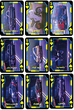


Character Suit ( Diamonds )
This is close to the last part of designing the cards, the only feature I will have left to make will be the letters for the Joker cards. But back to the Diamond suit, to start with I added the numbers to the design, this was done by using the template I had created not too long ago. It meant that I didn't have to add the numbers each time I make a different suit. So once the numbers were added it was time to create the diamond icon. This seems to be the easiest icon to make because all it has is straight lines, I started by creating an outline for the diamond. The outline was made with the pen tool and although creating this icon doesn't really text my pen tool skills I am still learning about keeping a shape symmetric. Now the outline has been created it was time to fill the outline in, this can be done two ways, one of those ways is expanding the appearance of the shape and using the live paint bucket tool to fill in the shape. The other way is when you use the pen tool, you are able to add the line colour and also a filled in colour. So this means if you select both to be yellow the lines you draw will be yellow and when you are going around and creating the outline the pen tool is filling in the empty space in the middle of the outline. So both quite effective ways to fill in any shape, out of the two I prefer the live paint bucket tool because it can get a bit confusing when the pen tool fills in the shape for you. Once the icon was made yellow I copied and pasted that icon so now I am left with two. I changed one of the icons to blue and placed it underneath the yellow icon. Therefore I am adding the shaded feature, once that was complete I was able to add it to the cards. I used the rectangle method I have spoke about before to line everything up. Now the icons were added to both sides of the playing cards. It is time to conclude the design process for this suit, the outcome that I have created is really good I believe. There is some areas that I wish I did better on, for example choosing some better images from the start. But apart from that the cards have come out how I wanted them too and it is a really good feeling to know I have created a good set of playing cards.


Back Design
Now all the suits have been completed it is time to create a back design for the playing cards. Before starting to design I had a look back at my research I conducted, the research covers various different back designs and I just wanted some inspiration for my own. Looking back it is clear to see how much detail some of the back designs actually have, for me I think I want to keep things simple and to be honest I want to see what I am able to achieve with my own imagination. Before starting the design process I thought it was important for me to create a quick sketch of a possible design. My main aim for the design was to keep everything symmetrical, so if I was to add a feature on one side of the design I would have to place it on the other side. The centre point of the design will be the Cyberpunk logo, so I really started the design off of that point, and I think the design that I have come up with will work really well paired against all the suits I have created. So now the sketch was complete it was time to start the design process, the first thing I did was create an outline of the playing card, the measurements were 8.9cm by 5.9cm (89mm by 59 mm). Once the outline was created it was time to add the main Cyberpunk logo, to get this logo I used the internet and found a PNG copy of the logo. Like my sketch I want to make this the main focus point of the design so I thought it would be best to create a border around the logo. This was the starting point that I would then be able to bridge off of. After the border was created around the logo I tried to follow the sketch, as I thought that design that I created would work really well. But as you can see I decided to start with something different. But after adding those different areas I soon came to realise that I didn't really like them and I quickly changed it back to the original sketch. The design so far has been created on Adobe Illustrator and I have used the pen tool to create all the lines you can see. By using the pen tool I am expanding my knowledge with the tool and hopefully with all this practice in this project will help me create better designs in projects to come. By following the sketch I created I was able to create the design on Adobe Illustrator very productively and now the design was exactly where I wanted it to be it was time to add some colour. I have two colour ways in mind so my next move will be to test both of them and see what they turn out looking like. So far I am really happy with the progress I am making with the back design, if I was to do it again I would consider making the design a bit more detailed maybe add something different than straight lines.


After I finished the outline it was time to add some colour to the design, to add colour I selected all the lines and expanded their appearance. This means that I am now able to use the live paint bucket tool to fill in the design with colour. The first variation of colour I decided to go for was yellow as the main colour and blue as the line colour. But when I was filling in this design with colour I soon ran into a problem. As you can see below there is an image showing the design to have no colour on the out sides of the design. This is because the design is on separate layers to the outline so when I expanded the appearance of the shape there were no lines on the outside edge making it possible to fill some parts of the design in with colour. So to get around this problem I created an outline of the playing card on the design layer and I then expanded the appearance of the shape. This meant that I was then able to fill in the outside edges of the design. I also had to think of a good colour to include in the middle of the design, this colour will be behind the main Cyberpunk logo. I thought that including a black would be best because then the colours in the logo would all be visible. If I was to fill it in with a yellow like the rest of the design it would result in the logo not being visible and as I am trying to make that the centre point of the design. It would mean the design that I have created hasn't lived up to my expectations. So now the design has been filled in correctly it was time to assess what it looked like. I think the design looks really good with the yellow as the main colour and the blue as the secondary colour. I think that it matches well with the logo because on the logo yellow is the main colour and blue is the shadow colour. The only part of the design that isn't working for me is the red outline, but I only have that there because I wanted it to be visible when I was creating the design, and also to make sure that when I was creating the design I didn't go outside of the measurements. So now it is time to change the design up, I made blue the main colour and yellow the secondary colour. As soon as I changed the colours around I knew instantly I didn't like it. I think that because of how the logo is the colours you chose important. If the logo has blue as its main colour and yellow was the secondary, no doubt this way I have laid out the colours would work. So I think it is clear to see I have made my mind up regarding the colour situation on the design, I am going to go for yellow as the main colour and blue as the secondary. I am also going to make sure to change the red outline to the same blue and I think that will really add to how the design looks. Overall I am very happy with how the design came out, I think I used my time effectively. However if I was to do this design again I would consider adding some extra features. Instead of having the crosses on the design I could have included a more detailed look, I would have really wanted to create something like you would see on a normal playing card. For example, to create what I am after I could have focused on creating one corner of the design to look really detailed and then copied and pasted it to the other corners. That is also something I could have used for this design instead of creating all the sides, I could have created one half and then copied and pasted it over to the other side.


Joker Design
To start this part of the design process, I decided it would be best for me to create a sketch. On the sketch I will be able to see a rough idea of what I want this idea to look like and once the sketch has been made I would be able to go on and create the design on Adobe illustrator. Now the sketch has been made it was time for me to open up the playing card template i made at the start of the design process. I will use this to create a template of the border included on the playing card. Once the template is created I will copy that over to an alternate illustrator document. As soon as I placed the outline I selected the gradient tool and clicked on the outline, this resulted in the outline having a black to white gradient appear. I didn't really want the gradient that appeared straight away so I went over to the gradient options and changed it to a circular gradient. But like the last time I did this, the circle that appears first is always too small so I quickly had to increase the size of the circle. To do this you can select anywhere in the shape or outline and all you have to do is hold and drag out your curser and this will make the circle larger. Now it was time to change the colour of the gradient, due to all the testing of different colours I could change the gradient too prior in the design process I had a clear gradient I wanted to use. I knew that for the colour I wanted it to be bright because the joker cards are normally different to the rest of the cards. So by adding a brighter colour it is signifying to the player that they have a joker card. The colour I decided to go for was a bright orange into a darker orange, this was a colour I tested for one of the suits. But I knew that I couldn't include it for the suits so I thought it would be perfect for this little suit of cards and I also really like how the colours look in the gradient form. The first big test for this bright gradient was to see if it matched with the blue and yellow border. I think that the colours match well and I was worried that they wouldn't because all of the other cards had darker background colours. So I was unsure how it would pair with a bright colour but i think they pair well together. My next move will be adding the character and character name to the design. This will be a big test because i need to make sure that the character is the main point of the design and i also need to make sure that the text i include is readable and if it isn't i will have to change the colour of the gradient. Which won't be the worst thing in the world because it will mean i will be able to test will colours i haven't done so in this design process.


Moving onto the next part of this design process, this part will be a lot of testing because I am not sure how everything is going to pair with the bright gradient background. So the first test is going to be seeing if the characters and the text will pair up well with the background. Adding the characters went well I think having the background how it is really expresses how the characters looks. The text has also paired well and if I am being honest I was more worried about this part that adding the character. This is because the text has a bright yellow included in it and the background also has a hint of yellow so paring these too together could work well or not work at all. But I feel that the text is still readable and that was the main concern about adding the text in. If the text was not readable I would off had to go back and think of another colour gradient I could include. But after both of the main features paring well with the background, I think it is time to say how well the background actually works with the design. I know I should of probably spoke about this a while ago but I had to find two characters that would best suit the role of jokers. So like I planned at the start of the project I decided to use the maelstrom gang, this gang plays an important role within the game so I thought they would fit the role of joker perfectly. The two characters I decided to use out of the gang were Royce and The Brick. These two characters seemed to be the leaders of the gang so it felt like they were made to fit the role of jokers in my deck of playing cards. The cards so far are looking really good, I next have to add the word Joker to the top left and bottom right of the design. Before starting this part I could see some potential problems happening. As we know these spaces were made for numbers and letters so fitting a word in there might be tricky. I don't want to make the word really squished and then making it hard to read. I want to be able to make the text easy to read and allow players to easily understand what these cards are. I started off by creating the word out of the letters I have used for all the other text. It is almost like I have created the whole alphabet in letters inspired by the Cyberpunk theme. Once the word was assembled I added it to the top left of the design, to do this I aligned the top of the letter J to the top of the border and that gave me enough room to place the word and still be able to read it. My next move will be mirroring the design over to the bottom right. I have to remember to keep the same measurements, so I could either memorize the measurements or I could right it down. Therefore when the text is mirrored it will look exactly the same as the original. Now the text has been added to the bottom right, it concludes the joker cards. Overall, I am very happy with how everything looks, and I think that I was worrying a lot about including the bright background but now I am able to see it all complete. Having that bright background really ties everything together and my next move will be getting the cards printed therefore I am able to play with them and take them to potential interviews for jobs or University interviews. If I was to do this part of the design process over again, I would consider changing the design completely. The reason behind saying that is on other decks of cards the joker card is normally different from the rest but of course I would still stick to the same theme. The parts i would change would be taking away the border design because that would allow me to make the joker text bigger and also would allow me to include a larger scale of the character. I could also add a unique background to the design therefore I am really showing players the difference between the joker cards and the normal cards included in the deck.


Final Evaluation
In this project i have discovered that with print and interactive media you are able to establish your skills within these four areas font, colours, images and text. With these you are able to create anything you could ever want. If I wanted to establish my own brand, I would be able to do so as those four areas would enable the brand to have some sort of recognition. I have also learnt about target audiences, with these forms of media you are able to create publications, newspapers and magazines that promote something that you are interested in and they also allow you to create those forms of media around your target audience. The two forms of media are different to one another because print media helps you deliver news and information through printed publications. On the other hand, interactive media is meant to engage the user and interact with them. These two are different because print media is supplying information and the interactive media is getting the users to interact with that source. For example, print media allows you to create magazines and newsletters, people are only reading those sources but with interactive media you could create a word search and you are allowing the user to interact in ways that print media can’t other. My idea going into this project was to create a pack of playing cards. These playing cards will created around the theme of Cyberpunk, so for example for one suit I would include characters and, on another suit, I would include important locations within the game. So, on each card there will be an important feature that users of the playing cards will be able to relate to if they have played the game. I decided to embark on this idea because through our current lockdowns I have been learning and playing new games with cards. So being able to create my own playing cards is very exciting because I will then be able to play with the cards myself and I will also be able to see the people around me play with the cards I have created.
For this idea I decided to create my target audience for people aged 15 +, and I am not being gender specific any gender will be able to play with the cards I create. I also don’t want to limit anyone playing with the cards but these factors are who I decided to create my playing cards for. The audience can live anywhere in the word and if I am being specific the playing cards would probably suit people who work at a casino and people who like to gamble. The target audiences’ hobbies might include playing with cards, these might include the game black jack and any other playing card game you can think of. I can best suit the needs of the target audience by creating a good-looking set of playing cards and also create a deck of playing cards that people would actually want to use for there games. Like I have mentioned above the target audience will be able to interact with my final outcome by using it to play their favourite cards games. Another way they could interact with my final outcome is if they are fans of the game, I have themed the cards around. Instead of playing a card game they could deal the cards out and see who got the best features included on the cards. So, there are different ways each person can interact with the playing cards I have created. The research that has inspired me the most is the game Cyberpunk and also the theme related with the word Cyberpunk. As well as that I also looked at other playing cards that already exist, I think this was the most profitable piece of research that I looked at. This is because I am able to see what works and what doesn’t work on a playing card. There might be a specific style that I like and after seeing that I might have tried to include it on my own playing card. There also might have been a feature that I didn’t like so by highlighting areas that don’t look good on playing cards I am able to make sure that I don’t include them on my own. On the areas that I don’t like I could think of ways to improve the areas and if the improvement makes the specific area look good. I could then go onto including it on my own design. Therefore, anything that I do include on my playing card is something that I actually like and overall should make the outcome of the playing card be exactly how I wanted it to be.
The biggest thing I have learnt from this project is not to rush my work. Before this project I found myself creating a design really fast. Although I like those designs, I feel that if I took my work a bit slower, I could have created an even better outcome. I feel that I have taken my time with this project and it has really shown what I am capable of. That also leads me onto talking about problems that I have encountered within this project. When I entered the project, I said to myself that if a problem occurs, I shouldn’t give up. I should work through it because most the time when you finish a problem the outcome if much better that you could have imagined it to be. Both of these things have made my outcome come out so much better that I expected it too. Moving forward I will still keep taking my time with everything that I do and I also want to learn to notice potential problems, and if any problems do occur, I will take my time and resolve the issues. To plan my designs final outcome, I created lots of different sketches. I find sketches to be important because without them you have no clear visual of your idea. Most of the time sketches don’t compare to your final outcome but I think with the sketches you are able to highlight potential issues in the design. Then you are able to fix those problems on the sketch and not worry about wasting time when you are the designing your outcome on the chosen software. I also gave myself a checklist, so day by day I went and decided what I wanted to accomplish for that day. For example, later on in the project I would set myself the task of completing one suit in one day. Therefore, I am making sure everything is on track and I am staying aware of everything I have completed and what still needs to be completed. Before starting this project, I had barely used the pen tool, I always found it hard to use and anything I did make resulted in a not so good outcome. So, I thought this project would be the perfect opportunity to change that. Before starting the design process, I did some experimentation with the pen tool and I used it as a way of getting better with using the tool. By doing the experimentation I was able to experiment with different techniques, these included creating different logos and each logo had their own design challenge. For one of the logos, I decided to create the Nike logo, this was a hard place to start but after a few goes of creating the Nike swoosh things starting looking in the right direction. I was able to create the logo with smoothness and control, this was something that I could never accomplish before starting the project. After finishing the project, it is clear to see that I have improved with the tool and I will carry on using it to strengthen my knowledge of the tool. I also learnt how to use the gradient tool. I think that before starting the project I only used it once or twice and it never really worked. But after using it in this project I am happy to say that I am able to use the tool and I am able to use it effectively in my designs. I think that interactive designs are going to become more popular because with the way we are looking at the moment, with lockdowns happening all the time. I think it is important for families to stay connected through these rough times and with interactive designs they are able to do so. If you think about what I have made for this project, playing cards are a form of interactive design and I know throughout this pandemic I was playing with playing cards all the time. Before this pandemic I only knew a few playing card games but now I am able to play a lot more. Even for my family and friends I was able to stay connected throughout all the lockdowns and this was all possible through interactive designs. So overall I think that after this pandemic interactive design will become more popular. My final outcome is interactive because it allows families and friends to play their favourite playing card games with. Everyone knows how to play at least one playing card game so being able to provide that for families and friends is very important to me. With the added bonus of the theme of the cards. For those who have played the Cyberpunk game. It allows those who have to interact with the cards and talk about all the features on the cards. They might have a favourite character and if they receive that in one of their games, they would be able to interact with it and talk to their fellow players about the card they have just received.
For me my favourite feature of my final outcome Is how all the playing cards tie together. Form the start of the project I knew I set myself a lot of work, I set myself 52 cards to be completed. This was a daunting task at first but once everything got rolling, the task seemed possible. I think that it was very important for me to keep everything within the Cyberpunk theme and how that has turned into my final outcome, makes it my favourite part. No card is not related to the theme and even most of the features have extra Cyberpunk themed features added to them. For example, when I included the locations onto the cards, I edited them on Photo-shop to fit the Cyberpunk look. With the Cyberpunk look you enhance the blues and the pinks so being able to do that to the cards really adds so much more detail. Overall, with the added features it makes the design look so much better than it would if I was to just include the pictures I found at the start of the project. Overall, I have found this project very enjoyable, from the moment I heard what the project entailed I was happy. I think due to the project being so open I was really able to show my creative side. I was able to do everything that I wanted to and by doing so I am expanding my knowledge in all new areas. I am also working on loads of new skills at the same time. Hopefully everything I have learnt in this project will be impact the outcome I am able to achieve in projects to come. If I was to do this project all over again, I wouldn’t change the idea I had I would possibly change the way I had completed some parts. For example, If I had some more time to complete this project, I would have liked to create my own background for some of the features. I feel that, if I did that It would make the designs more personal to me because I would be able to say that I created that. But apart from that I wouldn’t want to change anything regarding this project. I am happy with how everything went and the outcome I was able to produce was a lot better than I ever expected it to be.