Fanta Flavors
The first flavour I have decided to create is Rhubarb and Custard. Before going ahead with this
flavour I had to look and see if the flavour already existed. Luckily the flavour hasn't been created. I think that this flavour is different and will give users a completely different experience to what they are used too. This flavour will aim to please people who have a sweet tooth, and also those trying to taste a famous sweet in the form of a liquid. Using this flavour could enable me to create some cool illustrations that could turn my Fanta bottle into a high quality product. The next flavour I have come up with is Candy Floss, Candy floss can be imagined and used in multiple different ways. When I think of Candy Floss I think about going to a theme park and having the best time. This could be something that the flavour makes people feel when they are drinking it. Another aspect I could add is on the Fanta bottle label I could add multiple illustrations of theme parks and other events relevant to the theme of Candy Floss. The final flavour I have come up with is Pumpkin Spice. Due to the Halloween event that has just taken place it made me think about a flavour that could be related to that specific event. Using pumpkin spice could enable me to use different Halloween illustrations to build up the Fanta label.
Adobe Color Wheel
Adobe Colour wheel will come in very handy with this project. To use this site you will first need to have an idea of what colour you would use. For me, mine would be Pink, this is due to me choosing Candy Floss as my flavour for this project. So I first selected the colour of Candy Floss on the Adobe colour wheel. Once selected the main colour I chose the correct colour theory. The colour theory I am going to use is complementary. This theory enables you to get 3 colours that are close to your original colour and you also get two colours that are on the other end of the colour wheel. So because I chose pink as my colour, the colour wheel gave me two types of greens that compliment my main pink
colour. A key factor to remember when choosing
your colour is to make sure the colour mode is in
CYMK. This colour mode stands for Cyan,
Yellow, Magenta and Key (Black). This colour
scheme enables me to print in colour. If I was to
use the original set colour mode this being RGB.
I would only be able to print in Red, Green and
Blue.


Fanta Logo

Once I used the Colour wheel, I headed over to Adobe Illustrator and created the Fanta logo to fit my own colours. As you can see I went for a pink as one
of my main colours, this was due to me picking candy floss
as my flavour. Once I changed the background colour I
added another couple of colours that was chosen for
me by the colour wheel. These colours complimented
my main colour well and would be the colours I would
use to add extra illustrations to the logo. As you might
of seen most Fanta bottles have little illustration that
tells the customer what flavour the bottle is. The colours
that can be seen would be the colours that I would use to
create that small illustration. Overall I found using the colour
wheel very easy and was easy enough to transfer the colours over from the colour wheel to Adobe Illustrator. After using it a couple times I feel confident enough to work my way through most of the options on the colour wheel. This will
come in handy when creating any illustration and
also when I am struggling for a colour that
matches another colour. There are so many
options on the colour wheel I'm sure if I am in
any need of help for selected a colour this
website will help me a lot.

After choosing the colours from the Adobe colour wheel, I decided to start designing my flavour icon. This icon will be located at the bottom right of the logo
and will give users the information needed to work out what flavour
the bottle is. I started off by drawing the outline of the cotton candy.
I used the colour Pink (Colour Code- #CB68A5) once I finished off
creating the outline I decided to add some internal features. As you
can see I included some typography and also some extra details. Out
of the two I started with the typography. I wanted to give it a fresh
look and also fit the theme of the flavour. After finishing the
typography I went onto adding the extra line details and finished
off the icon with the green stick. Overall I was not happy with the
design and went back to the drawing board. I thought that the icon
looked tatty and the overall finish of the icon was not at a high
standard. After visiting the drawing board again I decided to try
another flavour and this flavour was Pumpkin Spice.
To start this new fresh design I had to revisit the Adobe colour wheel and find 3 colours that I would use to create a pumpkin. To start I drew an illustration, the illustration resembled a pumpkin. After finishing of the illustration I decided I needed to add some colour. This is where the colours chosen from the Adobe colour wheel come in. I used the lightest colour as the main portion of my pumpkin and used the middle shade colour as my outline. Using three colours was hard as I wanted to add little effects around the pumpkin. But to make a good logo you have to follow some guidelines and one of those guidelines was to use 3 colours. This is because if you use more than 3 colours it might make the logo look clustered with colour, and you want to make sure all colours that are used link with one another. To finish off the Pumpkin I filled in the stalk with the darkest shade of orange. This was the closest I could get to a stalk colour. This is why I struggled to use 3 colours as you know Pumpkin stalks are built up off numerous different shades. But I stuck with the 3 colour guideline and overall I am very happy with the outcome. After finishing of the pumpkin I needed to add the extra flavour and this was the spice.


After finishing the pumpkin I moved onto adding the extra ingredient to my flavour. This being the spice, I started off by outlining what I wanted to spice to look like. Then I turned back to the Adobe colour wheel and chose the main colour that I wanted the spice to be. Once I chose the main colour the colour wheel provided me with other colours that complimented the main colour well. As you can see below my main colour was a light brown and the colour wheel provided me with the other two colours. This was another challenge to use 3 colours because as you can see I would have liked to add some shading features to it but was unable to due to only having 3 colours to chose from. But I worked through it and overall I was very happy with the outcome of my design. In both the pumpkin and spice illustration, I used the paintbrush tool and also the live paint bucket tool. The only problem I encountered was sometimes when I expanded the appearance of the shape, I couldn't use the live paint brush tool so I had to go back to the option bar and expand the shape once again. This then enabled me to use the live paint brush tool. After finishing both of these illustrations, I moved onto combining them both together. If I was to redo this piece of work, I don't think I would change anything due to the limitations prevailed by the guidelines.


After finishing both illustrations I moved onto pairing the two flavours together, as you can see
that is the final product of combining them both
together. At the start of combining them both together
I started off with only adding one spice illustration.
After looking at it for a while I thought it looked
bland and boring. So I decided to add another spice
illustration and I think adding the second one
really helped it reach my expectation. As you can
see I think all of the colours suit each other well
and there are no problems with them being close
with each other. This was the final stage of completing
the flavour icon that I will add to the Fanta logo. Overall
I was very happy with it and thought that the process went really well.
I didn't run into any problems when completing this part of my design process and hopefully
i shouldn't run into any from this point forwards. My next steps were adding this icon to the Fanta logo.

After finishing combining the pumpkin and spices illustrations I moved onto transferring it onto the main Fanta logo. As you can see two colours
match on the logo and that is the main pumpkin
colour and the background circle of the logo. As
I mentioned it above I used the same colours
to give a clear indication as to what flavour the
bottle is. Overall I am really happy with the design
so far. Moving forward I am looking forward to seeing
what the logo is going to look like with text and
I might also add some additional features. These
features could include some Halloween illustrations.
For example for the smaller A I could add some cyclops
features. I know your probably wondering how it is relevant but the A has a small gap in the centre of it and a Cyclops only has one eye. So adding a scary mouth, an eye and even some horns could make the logo look Halloween themed.
After adding the flavour icon, I took my ideas and turned them into a reality. There are two images of the Fanta logo below, the image on the left is the first copy, adding my ideas and the image on the right is my second copy, adding my ideas to the logo. With both of them I started off by adding the Cyclops feature to the design. This is something that might not stay with the logo because it is obviously changing the main portion of the logo. So I will use it as a concept idea for now. To create the cyclops features I used the paint brush tool and the live paint bucket tool. Using the live paint bucket tool was a tricky one because I forgot to add these extra details to another layer, trying to select the shape was hard. But I worked through it. To get round this problem I had to use the direct selection tool and while selecting the paintbrush swoops I had to hold down shift. This enabled me to select more than one swoop at a time. After finishing off the extra details I added some text. As you can see on the two images they are in different locations. I started this process by adding a rectangular box and changed the outline thickness to around 2pt. This helped the box have definition. After finishing the box I added the text and chose a sans serif font. After completing the first copy of the logo I was unhappy with where the text was sitting. So on the second copy I decided to change it about a bit and move it so it was hanging of the logo. This was very similar to what the flavour icons were doing too. Overall I was very happy with the outcome of the second copy of the logo. The only change I might have to make is removing the cyclops features and adding some extra features that don't involve changing the Fanta logo. For example, I could add some misty clouds that make the logo look like it is a moon. Therefore it highlights that the Fanta bottle is a Halloween themed bottle.


After finishing completely a copy of the Fanta logo, i showed my tutor the finished logo but due to the added features on the letter A i was
unable to use that copy of the Fanta logo. So
back to the drawing board i was. I decided
what would be best would be to copy
the Fanta logo into 5 different documents
and and experiment with them. What i mean
by this is i would make sure each logo design
is different and unique. To decide which one
i liked the best i turned to twitter and created
a poll where i could get other peoples
opinions regarding my work that i have created.
After looking at the feedback it was clear to see
which logo took everyone's fancy. This was the
logo located at the bottom of the image on the
right. I have to say this was my favourite logo
out of all of them i have created. This was because
i thought it offered something different. What i mean
by this is that it uses an unusual shape to hold the text. This is something you don't normally
see Fanta doing and this gives me the perfect opportunity to use it. Overall i am very happy with the outcome with all of the logos, there wasn't one logo that didn't float my boat. If i was to do it again i would focus my time on adding some extra details to each logo for example adding the next step, therefore in my circumstances i could show what the logo would look like with clouds under the logo. This is something that i look to include when it comes to designing the label for the Fanta bottle.


After finally finishing off my logo i decided to go ahead and create some cloud illustrations.
These clouds will be used in the Fanta
label. To create these cloud illustrations
i used the software Adobe illustrator.
On this software i used the paintbrush
tool and the live paint bucket tool. Overall
i did not run into any problems when
creating these clouds. Below this text you
will be able to see what the illustrations
look like combined with the logo. This is
a rough layout of how i would want my label
to look like. The only change regarding
the label would be changing the label colour. Instead of keeping it as a solid colour i could add some gradient to it therefore giving me a label that hasn't been used before. Also that gives it an unique effect. When adding the clouds to the logo i had to copy and paste some of the clouds to build up the overall mass of clouds. Overall i am really happy with the outcome of the two components partnering together. If i was to do it again i could add some clouds in front of the bottom half of the logo. But to do so i would have to lower the opacity down. On the other hand this idea might take away the effect from the logo and we wouldn't want that to happy as that is the centre piece of the label. Finally, i also added a white border around the orange part of the logo. This was because i was using an orange coloured label so i didn't want the orange in the logo to clash with the orange on the label. This is where i come up with the idea to add a white border around it. This also links in with the colours of the clouds and doesn't take the view away from the logo.

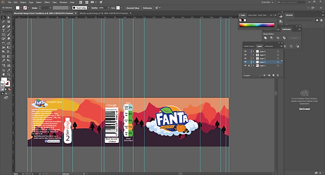
After adding the clouds and the finished logo together it was time to create some concept ideas for the Fanta bottle Label. My first idea was to create a mountain range that uses similar colours to the ones used in the Logo. To create the mountain range background i started off my creating a rough outline of what the first layer of the mountain range to look like. This would then enable me to add layers to the design. As you can see below i have used the the same layer multiple times but the only real change that has occurred is the position and colour of the layer. The layers are providing a depth display within the logo and starts with a dark colour and works its way through to a clam neutral colour. To fit the design into the provided label space i had to use a tool called the clipping tool. What this does is if your image is to big for a certain space and you would want it to only been seen in the designated space this is the tool you use. When using it you would start with using the Rectangle tool and map out the space you would want your image to lie in. An important factor is to make sure the Rectangle used is on a different layer to the layer where your image is. Once the rectangle is drawn you should move the image into the area you would want it to sit, and after that you should select both the rectangle and the image. You could use shift to complete that process. Once both objects are selected you should go to the top tab bar and select object then hit Clipping mask and then Make. This will then make your image only visible in the area you drew with the rectangle. After finishing off this first label design i realised something. This something was quite important, when the actual Fanta label is removed the Fanta logo is located on the right hand side of the label. Therefore i would have to re-do my design below. As you can see where i have placed the Fanta logo it is in the wrong place and also the mountain range behind it is made to fit the Logo being in the middle. So silly me will have to redesign this label. This will not only be able to help me produce a higher standard label it will help me learn more about colour theory and how the colours i use could impact the boldness of my Fanta logo.


After finishing the first mock up design it was clear to me that i had to think of something different. Think of something that you wouldn't normally see. In this design i have used two themes, one being Halloween and one being Autumn. As you can see there are two designs around this piece of text. The one above is the front side of the label this is the side that can be seen when you look at the bottle. The design below is the side that can't be seen straight away it can only be seen when the label is removed. I will talk about the design above this piece of text first. To start with i added the Halloween features this included a little Dare, as you can see i have added some text and this text says "Remove the label if you Dare". This adds some scary factor to the label and follows along nicely with the Halloween theme. I also added some question marks and exclamation marks, this builds up the suspense with the text provided. Overall i am not really happy with the outcome of this design it didn't seem to fulfil my expectations. Next time i could make the page not so busy i could add smaller details and i think that would work quite nicely. Next up we have the back of the label this being the design underneath the piece of text. This is a maze that viewers can play. In the middle of the maze i was thinking about adding a QR code that sends you to a Snapchat filter. This Snapchat filter will include something to do with Fanta or even could be something to do with Halloween. They are just some rough ideas of what i could do to reward those to decide to complete the maze. Overall i was quite happy with the design because i feel that many people haven't thought of this idea and could be a unique feature that i add to my label. The joy of it being placed on the back of the label means that with whatever label i decide to go ahead with i could place it on there and add to the overall enjoyment of having My Fanta bottle.

This is the final Design i have been able to create. This design was inspired by the first design i did for the label. The first mountain range i created needed some improvements and i am happy to say the mountain range below has really shown some improvement from the previous one. This time i have really focused on the colours that i used. Making sure that they resemble the theme i am trying to achieve. The colours used are all different shades of Orange, i used the colour Orange due to the flavour of the Fanta being Pumpkin Spice. Therefore it links all into one. If i was to use any other selection of colour it would make the design look odd and also make the design not match. I really think by using the colours i have has made the Fanta logo pop out of the label and has been made into a prominent feature. When adding the extra details, for example adding the Nutritional Facts i could use the colour white to border those facts and make it easy for viewers to read. When i was conducting primary research it was made clear to me that making sure all needed facts are clear and readable. There is nothing worse than looking at a bottle design and not being able to read what is in the bottle. This factor becomes important when someone might be allergic to a certain ingredient without the information being clear the person may drink the drink and have an allergic reaction. Overall i am very happy with this design and this will probably be the design i am going to use for the rest of the project. If i was to do it over again i would consider making the design around the measurements of the label. Due to me creating the background on another document then copying it onto the document with the label designs on it. It has made the background look stretched but on the other hand it still doesn't look to bad, i am very happy with the outcome.

After finalizing my final label design i went and added some guidelines. These will help me place all the included features in the
correct position. To get guidelines onto
your work you will need to go to view,
then rulers and finally click on show
rulers. By doing this process you are
enabling yourself to be able to place
guidelines like i have. As you might of
seen my background is slightly different
to the background you can see above,
all i have done is change the location of
the background image and also
removed the clouds. I found having the
clouds a bit random and didn't really
tie in the whole mountain theme. Overall
this step was quite straight forward and by using the guidelines i know where to place all the extra features and also the correct sizing of each individual feature.

After adding the guidelines i went about adding some of the extra features that build up a logo,
i started with the GDA, the GDA stands Guideline Daily Amount and this is a nutrition facts label that originally began in 1998 as a collaboration between the UK government, the food industry and consumer organizations. To start the design process of this feature i began with drawing the outline of a GDA, once outlined i added colour and then went onto adding text. This was the tricky part of this design process. To start with i thought the size of the text was going to correct and wouldn't have any worries when printing the label. But i thought before i add any extra i would need to make sure that the size of the text was good. So the printing began and that's where the problems began. As soon as i saw the size of the text i knew that it was unreadable and change had to be made. So i went back to Adobe illustrator and resized the font. It was quite a challenge due to the lack of space given. Some of the titles in the GDA like "Saturates" was a challenge to get on but after changing the font size for the second time. It came out the way i wanted it, don't get me wrong you cannot see the text from miles away but if you look closely as you would with any over bottle you would be able to read the content of the GDA. I then went onto adding the barcode and also the size of the bottle. This step was quite easy as the barcode used was created
a couple days ago. So all i had to do was
add the barcode onto the label design. The
next step after adding the barcode was
adding the size of the bottle. Doing so wasn't
to hard the only trouble i had was getting the
correct font for the letter "e". But after some
trial and error i finally got the correct one.
Overall i am very happy with the content of
the label and everything so far is going
smoothly. If i was to do it again i would
consider the size of the text a bit earlier than
what i did.


After adding the barcode and GDA, i added the ingredients list i created a couple days ago. With the ingredients i used mainly
most of the original ingredients that are
provided on the original Fanta label. The
only change i made was adding my own
flavour to it and this being Pumpkin Spice.
When adding the ingredients and other small
details i was worried i was going to run into
some problems. These problems are
identical to the problems i encountered
when creating my GDA. I was worried that
when it came to printing of the ingredients
list i was worried that viewers wouldn't be
able to see it. So after raising this concern
i went about printing my design to see how it would look like on paper. Luckily the ingredients are readable and only small changes would be needed to make it that much better. Having the ingredients clear to see and read are important for those who need it. If someone is allergic to an ingredient in a drink or food they are obviously going to need to read the ingredients list. This is why i have made sure that the ingredients list is clear and readable. Nothing worse than a list that can't be read. Overall i am very happy with the outcome of the label so far and only a few changes would be needed to make this label that little bit better.
This next part concludes most of the features that need to be added to the logo. As you can see there are three images in each image there is something new added to the design. The next feature i added after finishing the previous steps was adding a servings icon. The icon is basically to make people aware that the drink is able to serve 2 people. I started off my drawing the outline of a Fanta bottle. Once finished i expanded that outline and used the live paint bucket tool to fill the outline in. The colour i chose was white. Next i added some text, this text included "servings 2". Originally i used the a black font in this icon but when i added it to the label it didn't look to my liking. So i went back and changed the colour way. I went for a two tone colourway. The colours resemble the background colour. By using these colours is basically makes the font look see through, it was quite a unique effect i thought at the time of creating it. After i was happy with that part of the logo i went onto adding the Nutrition Information. Out of all of the information added to the label this was going to be the hardest bit. This was due to the lack of space provided and also due to the lack of space it gave me problems when adding the text. The text seems to be a recurring problem in this design. But i do like a challenge so off i went creating this new feature. Designing the box that housed the text was easy and adding the text wasn't so hard either. To create the box i used the Line tool and also the rectangular tool. I expanded all the combined shapes and lines so that i could use the live paint brush tool. This tool is used to colour in the shapes i just created. So after finishing the nutritional information box it was time to add it to the label. Adding this feature to the label went well, but i had some concerns about the size of the font. So yet again i paused the design process and printed the label as it was. This was just to see the way to font looked and to see if any changes were needed. Yet again the font i has created was too small so back to the design process. After seeing the font was too small, i decided to make a change to the design process in ways of adding font. I was going to pick a size font, this size font will be used throughout the design and also i will make sure that when the label comes to print this font will be readable and accessible to those who need it. After going through that problem i added the final touches to the label. This was the contact information, this information i was copied of the original Fanta bottle as i was unsure of the top of my head what information i should add. So i designed some mail, phone and mouse icons to be placed next to the links. The process of those was very simple. I gathered some
inspiration of these icons of the internet
and by using those sources of inspiration
i was able to create the icons you can see
on the label. Overall i am very happy with
the outcome of the design, there are still
ways to go to get this label complete. To see
the ways i can improve this label i will print it
out and stick it on the Fanta label. Therefore it
gives me an in person look at the label and any
improvements need i can write them down and
after all problems are found i will go back to
designing and come out with a better and
stronger finished label.


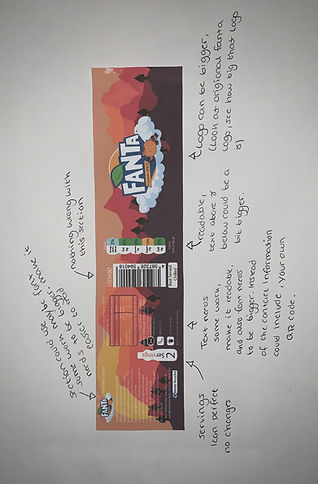
After finishing adding all the features to the label i decided to print it and see what areas still needed some improvements. As you can
see i have added an image that shows
my label. I went through each separate
feature and thought if that certain area
needed some improvements. Firstly, i
started with the logo, i found the logo to be
small and not able to fill the space provided.
I then went to the GDA and there was
nothing wrong with that area the only
change to be made there would be the text
below and above it. All i would need to do
is make it that little bit bigger. Then
i went to the nutritional values section and
the only improvement there would be
making the text a bit larger therefore making
it easier to read. Next we have the servings
icon, i didn't find anything wrong with that section so i marked that as complete. I finally moved onto the ingredients feature and noticed that the text was hard to read so i would need to go back to Adobe Illustrator and make that text a little bit bigger. So overall the biggest change that will be happening will be enlarging some text and also the main logo.

After following the instructions i provided myself with in the previous step i moved onto making those adjustments. As well as
making those adjustments i also added
something else. This was a QR code, this
QR code will allow viewers to able to
view this website you are currently
reading off. Including this was an important
step as i could use this bottle for interviews
and after the interview is concluded i
could mention the fact that the QR code
takes you directly to my coursework. When
fitting the QR i was confident that the
sizing of it was correct. But when it came to
viewing it in person it was clear that the
size i had put it was too small. The size
of the QR code meant that when i tried to
scan it, it would just not work. So back i
went to designing it and also re-locating
it. What i did to make the QR code bigger
was cut out the "Scan Me" text. To do
this i used the clipping mask tool. This
means that i drew a rectangle above the
QR code and selected both items at the
same time. Once both selected i went
onto the clipping mask tool and made
it so only the scannable QR part was
visible. This meant i could make the
QR code easier to scan when seen in
person. Where i placed the QR code,
wasn't the best place for it i felt. This was
due to the amount of features already
located in that section of the label. So
back to designing i went and decided to
try something different. Due to the
amount of free space i had on the right
hand side of the bottle i knew that
could be perfect place for it. So i tried
it and overall i was very happy with
how it came out. I also added a location
for the glue, when it comes to adding it
to the Fanta bottle. This will help me
know exactly where i need to place the
glue and also means i wouldn't be
sticking it the wrong way. Finally, after
placing all the features so far i had to
print out the label to see if everything matched up to my expectation, and so far everything has, the QR code work and all font included is readable and clear. The label so far has achieved everything i wanted it to and now i only have to think of something fun to include below the QR code. This could be how to make the flavour or even a fun little game for the viewers of the bottle. Overall i am very happy with the design process so far and this part of the design process went really well. If i had to do it again i would focus my time more on the font sizing and making sure that the font goes right the first time instead of having to go back and forward over and over again.


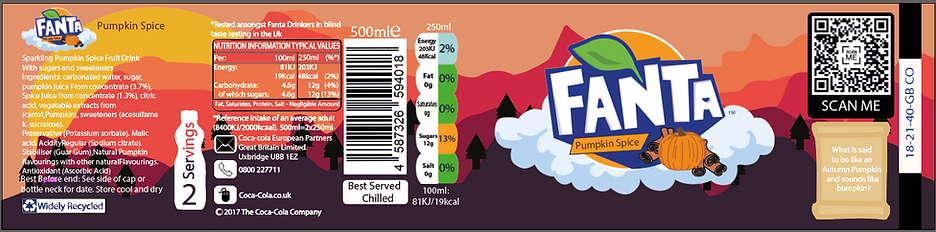
After choosing the final location of the QR code, i moved onto adding something extra. To start with when i saw the QR code on the right of the design, i thought it looked out of place there was nothing there to fill the open space. But i came up with the idea to place a riddle. This is something fun and entertaining for the viewers of the bottle and the answer to the riddle is hidden with logo. The riddle says " What is said to be like an Autumn Pumpkin and sounds like bumpkin?". The answer is Pumpkin. I didn't want to make it too hard for the viewers as i wanted it to be fun and enjoyable. Overall this label design has turned out better than what i expected it to be. At each step of the design process i made sure that i would look at the label and see if there are any improvements needed to make the design better. So after every improvement i listed i made sure i completed that improvement to the design. Another key feature that made this design so promising was taking part in the Peer assessment. Although this was based on the entirety of my work, i still made sure that i asked what they thought of the design and if there were any improvements. Still looking at the design i feel that there could be a few improvements needed, but if i am looking at it overall i am very happy with it. From the ideas i had at the sketching stage of the design to what i have achieved now, it has made a massive jump. The final design has followed some of the highlighted features from the sketch stage. This included having a mountain range as a background and also having the logo sit on some clouds. But there was one important feature that did change and that was the theme of the design. By going with Pumpkin Spice it gave me two option to chose, one being Halloween and one also being Autumn. At the start of the design process my main focus was making a design that covered the Halloween theme but heading to the end of the design process it is clear to see i have gone for Autumn. I used warm colours to promote the feel of Autumn and i felt that if i was to go for a Halloween themed design there would be too much going on and it would take the effect of the main logo away. If i was to do this process again the only portion i would change is making sure i gather enough research to make the font sizing go right the first time. I feel that in this design process i was back and forward with the font so getting it right the first time could of helped me out a lot. But overall i am very happy with the design and the way the design process evolved.


After i thought i was finished with my label design i sent my design over to my tutor so he could assess it in an industry styled format. As you can see above this text he has sent me back my work with different improvements that i could make. By doing this it will further my knowledge of using the Adobe illustrator software and also will help the finished product of my design be the highest it can possible be. To start with i followed the first improvement and that was the text i had inserted. The Fanta bottle that i had used for inspiration had the text that i had included. But my tutors bottle had other wise. So going through the improvements i explained to my tutor that the bottle i was following had the text i used and everything was fine for me to use the text that i had included. The following improvement was to make the QR code smaller and add some illustrations around. After receiving this improvement i knew that i couldn't follow it, this was because when it came to printing the label and the QR code is any smaller that what it is now. It makes it hard for phones to scan it and produce this website you are reading off now. But i knew following the improvement steps that adding some illustrations behind it could come in handy and add some extra features to the label. So i come up with the idea to create a box around the QR code and it says to scan me. This therefore provides a clear indication of what to do to this QR code and if anyone was unsure what this feature is, the text provided should give some clue in what they have to do. Moving on there were some silly mistakes that were made when designing the label. This was in the Nutritional Values box i had made the letter i bold. This i something that i obviously didn't spot and this shows why getting another person to look at your work always comes in handy. When adding the new text i ran into some problems. What i didn't realise i did sometime in the design process, was i expanded the text and this made it impossible to edit the text. So after spending some time removing all the text around the letter i, i moved onto typing that text up again and adding it back in. But due to me not expanding this new text i realised that the new text that i added looked different to the text already there. So back to editing i went and like i mentioned earlier all i had to do to get the two types of text to match was to expand the new text. This therefore made the new text look similar to the original text. After this i moved onto the next improvement and this was changing the word saturates. If you scroll up to my previous work you will be able to see that the word Saturates is a lot smaller than the rest of the words and also because the text is smaller it makes it hard to read. So after receiving this as an improvement i made sure i got straight to it. To start with i erased the original text and added in the new text. I had to make sure that this new text was in the bold format, this was due to the fact that all the other pieces of text in the GDA, were in the bold format. After finishing the GDA improvements i went onto a smaller improvement task and this involved me aligning the 500ml text to the barcode. To make sure the text was align with the barcode, i used a ruler. My first steps with the ruler was dragging it from the left hand side of the document, this made sure that the ruler guide was vertical not horizontal. I dragged this ruler guide to the middle of the barcode, therefore it made a precise location for the text to rest. Getting onto the final two improvements, the second to last one was coming up with a background feature that included my riddle. Before the riddle was just resting as text, no background to it. In my own words the riddle looked out of place and due to the tutor highlighting it as well i knew i had to do something about it. So i started thinking of some ideas. I wanted to make it fun and enjoyable for those who want to work it out. So my best idea was to place it on a scroll. The design i went for made it look like the riddle had just been uncovered and ready for those who dare to work it out. I used sandy colours and made sure that there was no black outlines. It would look displaced if the scroll had a black outline, this is because in this project i have tried to stay away from using a black outline. I wanted to see what certain designs looked like without them and i am happy to say all the features that i have added to this label look incredible good. In the future i am sure that i won't be outlining many things with the colour black. The final improvement that i have to add is making sure the glue strip is exactly where i need it to be. If it is too big i could be at risk of seeing it when the label is printed and stuck on the Fanta bottle. After finishing all improvements i went onto sending the new copy of my label back to my tutor to re-assess.


After sending back my updated label my tutor had returned it with some few extra adjustments that need to be made. Firstly, it was clear to see what needed to be improved on the servings bottle there were some lines that were see through. So i went back to investigate it on my illustrator file but on the file there was no line that appeared. This made me confused, so i asked my tutor about it and he told me about this problem that does occur if i was to print my work. If i was to print the label these lines would appear at no fault of my own it was something that just happens. So to work around this problem all i would need to do is outline the bottle with the pencil tool. When i did this it engulfed the bottle and made the text un viewable. So to fix this problem i selected this new outline that i made and placed it on a layer below the bottle. My next improvement was adding a white rectangular box to the barcode. Before the barcode had no white outline on the left hand side. So to get around this problem i used the rectangular tool and made it fit the barcode exactly. Next i moved onto some extra improvements on the GDA. After fixing the problem with the word Saturates being tool small i had to re-align the Energy part. Before this part was off centred and to make the GDA look professional i had to make sure all the text included was correctly positioned. This concluded this copy of the label. So far i am very happy with all the improvements i have made. This so far has made my label design a lot more professional and overall fit the expectations i have made out before starting this design process. This style of back and forward with my tutor helps me get use to the type of responses i could get be getting when in the graphic design industry. Without these improvements i would of been left with a not so good label design. Even though these improvements are small each one has aided me in the correct way, it has helped me work on my label and highlight areas that i wouldn't of noticed and also has helped me boost my professionalism in this area of work. After finishing off all my improvements i will send back this version of my label to my tutor and see what feedback i will receive.


After sending my second copy of the label to my tutor, i yet again received some feedback. This feedback involved me making some improvements to the left hand side of the label. To start with i worked through the first improvement i received. This was to make sure that there was no hyphens used in my ingredients list. Before the improvements were made the word Preservative was cut into two so it looked some thing like this "Preserva-tives". The improvement was to make sure that it was displayed as one whole word. So i went ahead and made sure that the word was together, when i did this i came across a problem. The problem was that when i made the word a whole, the text was lowered by one and made the text over-lap another text. So to get around this problem i had to resize the text and in the back of my head i was thinking about making sure the text wasn't too small and couldn't be read when it was printed. So with all of these thoughts accounted for i made the text smaller and also re-located it. The re-location was only slight and after that everything was complete for that improvement. The next improvement was to make the Widely recycled logo equal. Before making the improvements the logo was irregular and had different sized spacing from each corner of the outline. This was quite an easy fix all i had to do was resize the logo and made sure all spaces between the outline and the logo were equal. My final improvement was to make the servings bottle have a straight line at the bottom of it. Before it was uneven and had numerous misshapen bumps. This made the feature look not professional and overall made it look like a 5 year old drew it. To fix this problem it was pretty easy all i had to use was the straight line tool and that sorted the problem straight out. After finishing all these improvements i had a look at my design and when i was looking at it, i didn't see any clear improvements that needed to be made. So hopefully after finishing all the improvements that were highlighted by my tutor, this will be the final copy. Before i know this will be the final copy i will send the latest copy of the label to my tutor and see if he can find any extra improvements.


After getting the final okay from my tutor it was time to print, as you can see below this is what it looks like. One of the first thoughts was making sure the barcode works and leads you straight to this website. Before the final print i have had numerous problems with this QR not working, so to finally see it working and being displayed in the labels final formed makes me very happy. Below this piece of text you will be able to watch a short video, this video shows the QR code to be working and can be easily scanned. This will come in handy when taking to any sort of interview. Instead of telling the interviewers my URL to the website i can give them the Fanta bottle to keep and they will be able to access everything from there. It is always nice to see a finished product and those problems that did occur were all sorted. Talking about problem i had a few problems about the text not being visible. I am happy to say that the text on the final label is readable and clear. Yet again a problem that kept happening before has been solved and overall i am very pleased to see it all form together. Another first thought was looking at the glue strip, i thought that when i place it onto the bottle you are going to be able to see it. Luckily when i did place it around the bottle there was no sign of the glue strip and yet again another problem has been ticked off. When the label was finally on the the bottle, there were some few minor problems that i had run into. Once of the problems was that when i was looking at the logo straight on you was able to see the GDA, QR code and riddle. This is something that i want to avoid as i would like the logo to be only in view when looking straight on at it. So after identifying those problems i went back to Adobe illustrator and moved the barcode and GDA over to the left. I also managed to make the QR code and riddle smaller in size. I had some worries when making that change because i didn't want to make the QR code so small that it wouldn't scan.

On the second version of my final product i moved the Barcode, GDA, QR code and also the riddle. This enabled me to have more room for my logo and should hopefully mean when i look straight on at the logo the only thing you can see is that. After moving everything i went onto printing it. This was the moment of truth to see if the changes i had made, made any difference. Unfortunately they didn't have an effect and when i looked at the logo straight on the features i described earlier were still visible. I know your probably wondering why i am being so picky with this step. This is because i see everything else on the label to be perfect and this little problem that has occurred has made the label not so perfect. I also don't mind a bit of problem solving as throughout each project i will be taking part in there will always be a problem that occurs. Hopefully this little problem will be the last that i face in this project. I will go back to the Adobe Illustrator to move each feature piece by piece. I think they say third time lucky so hopefully this will be my lucky time. Overall i am very happy with the way things are progressing. I wasn't expecting any problems in the later stages of my design but like i said earlier there are always new problems that need fixing. I am happy that they problems have shown now instead of in the future when i turn up to an interview and i can clearly see the problems in the label design. If i was to do this again i would look at using a mock up instead of printing the design over and over again. Using a mock up can help in numerous different ways. But it overall helps to visualize what the design would look like wrapped around the Fanta bottle.
After reviewing my Fanta wrapper there were still some mistakes that were not visible at the time. It's hard to think that i thought everything was done and i was completely oblivious to the mistakes that were made. You might of spotted it but the main mistake that i had made was miss spelling the word Pumpkin in the main logo. Something so little but something so important. It just shows that i should of been more aware when checking my work and also making sure that after everything that i type it is spelt correctly. There was another mistake that wasn't completely obvious but still needed to be fixed. This was in the ingredients list, i had placed two words next to each other without adding a space in-between. Yet again my spelling and checking skills have gone to waste as something like that you would think is easy to spot. However back to the positive now i have found these mistakes i feel happy to say that i have completed the wrapper. So i think anyways !. After seeing the final wrapper it made me realise the amount of work that went into completing it. The work paid of i feel, starting from having a completely different flavour and now i have a new flavour and i couldn't be happier. All the ideas come into place, maybe some ideas weren't as good as others but the main idea stuck. From moment i changed my flavour i knew i wanted to create something with warm colours and something to fit the theme i was gong for. Due to the flavour of my Fanta i knew i could go for two themes, 1, Halloween and 2. Autumn. I feel that my theme at the end of the project was Autumn this is due to the warm colours and mountain range setting. It reminds me of the views you would get when the sun is setting in the distance. The background label really makes you think of happiness, and this is something that i find so important to promote. Due to the current events happening in the world. It seems that people are down and un happy so by creating something uplifting i feel that i can turn a smile on peoples faces. There was a lot of problems that i encountered when making this design but like everything there is always an end goal and i feel that i have been able to achieve that end goal that i knew and expected myself to reach.

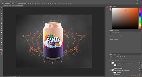
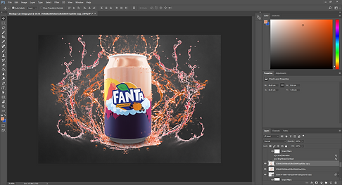
After completing the Fanta label i was set a new task and this task involved me creating a Fanta can mock up. To start this process i was giving a blank can mock up. This mock up was downloaded off mock up world. I find using the mock ups from this website very useful as it gives you an insight of what your design is going to look like in person. There is no need to keep printing it out all you would need to do is place your design on a mock up and see what the visual representation of your design looks like. After loading up the mock up i straight away got on with adding my own background design. To add designs to the mock up all you would need to so it double click on the Cans layer. I know your probably wondering what i mean so i'm going to tell you. When you open up a mock up there is normally a layer that is labelled "click me", if not you can easily tell what layer you need to use. The layer has an icon and that icon will have a small feature located on the bottom right of it. When the layers icon has that it means you have found the right layer. So double click on that icon but make sure you don't double click on the small feature. This is because if that is double clicked it won't take you through to where you need to be. Once the correct position is double clicked you will be taken to a new document. For me i was taken to a document that was only filled with the colour blue. Can you spot the representation yet. When you double click on that layer you are opening that layer by its self. Therefore it makes it easier to edit and add things to it. So once the new document was opened i added my background design to it. Once i was happy with the position i clicked saved and headed back onto the main can mock-up. This is what you are seeing in the right image below this text. Overall i am very happy with the way this design step went and if i was to do it again i don't think i would change a thing. This was due to everything going the way i wanted it to.


After seeing my background design on the can mock up i knew something didn't look right. When i added my design it didn't show the true colours i had chosen. So i dove into all the separate shadow layers and found the one that was taking away all the correct colours. To remove the shadow layer all i did was click the eye icon. This means that the layer can't be seen and if i was to want this shadow effect back all i would need to do is click back on where the eye icon was. After removing the shadow layer the can instantly looked better, i think the reason it looks better is because of the colours. The colours before were light and didn't seem to show much umpth, where as now when the shadow layer is gone the can attracts everyone's eyes and it just shows that such a simple thing can change the look of the design. After finally, getting the can to be where i want it i decided to add my logo to it. To do this you follow the simple steps i spoke about earlier. The only problem that might occur with this is because it is quite a small feature the position that i expect it to be might be a bit off. Unfortunately, i did encounter that problem and i had to go back and forward with the can layer. I moved the logo one place and it didn't look good so i moved it again and yet again it still didn't look good. But luckily after numerous amounts of trying to get the logo in the right position i finally got it. It was in the position i expected it to be in, a way i could off got around this problem was using the ruler guides. By using this i could mark out the correct position of the logo and i wouldn't have o go back and forward all the times. But apart from that this designs stage went well and now i think it is time to add to the background behind the can.


In this stage my main focus was the background behind the can, i didn't want to leave it how it was as it seemed dull and boring. So i did a bit of brain storming and came up with the idea to add some water effects. I started with downloading some water effects of the internet these were in PNG form. I started with one form of water effects, this can be seen on the left image below this text. As you can see the water is coloured differently this is because i wanted to make the colours fit the theme of the can. So i decided to go for an orange and red look. To change the colours of the water effects i used the HUE/Saturation levels. This is something i have spoken about a lot in the previous project so with that knowledge it has enabled me to use this feature without running into any problems. The first layer was complete and i was very happy with it. There was only one thing missing and that was it didn't quite have the wow factor. So i decided to add some more water effect and again i changed the HUE/Saturation levels to the colours i chose before hand. This can be seen in the image on the right below this text. As you can see it is a lot more built up and shows some depth in the image. I tried to make the can look like it has been slammed down and the water effect is an aftermath of that. So after adding some extra water effects o think that part of the design was complete. There was a part of me that wanted to do more but another side of me was telling me not to over do it. I think if i did add extra water effects it would of over done it so i am happy with where the mock-up is at, at the moment. Overall i am very happy with the design, if i was to do this again i would consider making the water effects myself or even make the background behind the design a bit more interesting because at the moment there isn't a lot that is going on.
After finishing off my can design i was tasked with creating my own advertisement. I don't know if the work i completed below counts as an advertisement but i had fun doing it. For the advertisement i decided to create a motion graphic. This isn't the first time i have touched motion graphics. At the end of the last project i touched on this particular topic a little bit. Although i had that prior knowledge i still had to use a tutorial to create the motion graphic you can see below. If you have already watched the motion graphic it is clear to see that i haven't used the logo i have been using throughout this project. This is because i wanted to try something new, although it was a small change i still think it made the logo look a lot different. The whole process of making the motion graphic went smoothly. Overall after watching the tutorial it expanded my knowledge in this area. When making the motion graphics i am always trying to learn something new. So with this motion graphic below i was using all new effects. This is something i have used before but before i used different effects to the ones used in the motion graphic below. There are some areas that still need some changing when it comes to making motion graphics. In particular at the end of this motion graphic i found the text used to describe the flavour was hard to read. This might be due to the effects used to create it. To get around this problem i could mess around with the effect that changes the images look. I could make it so that the effect doesn't mess with the look entirely it still has the key components visible such as text. Another key area in the motion graphic was adding sound. Adding sound was completed on another software, i had to use adobe premiere pro to add the sound. To get the same sound effects used in the video i had to transform the YouTube video into a mp3 format. Once that was complete i added it to the mp4 video created in adobe after effects. After a bit of touch ups and and moving the sound around to fit the video. It was complete. I find that when adding sound it really adds to the overall effect of the video. It gets you a lot more sucked in that it would be just watching a video with no sound. For my next motion graphic i would like to create something to do with a poster. You see it all the time when someone makes something in the poster move, that is something that could work quite well for my next motion graphic. The only challenge i might encounter is making the poster fit the theme of this project.
After thinking to myself about the previous motion graphic i wanted to change some things up. Instead of focusing on the logo i wanted to show of the completed bottle. I started off by taking a photo of the bottle. Obviously this photo is going to have background that i don't want so i will have to go to photo-shop and resolve the issue there. When the image laid in photo-shop i though using the magic wand tool would be very useful but due to the image having different background colours and also different shades of darkness it was nearly impossible to get a clear cut with the magic wand. So i used the eraser tool using this wasn't too bad i outlined the bottle then i used the magic wand tool to get rid of the excess background. In the future i would make sure that the place i am taking the photo has a clear background and is well light. This will mean when it comes to editing it on photo-shop i can get rid of the background a lot easier. To create the motion graphic i used another tutorial. Like i said in the previous motion graphic i am still trying to get an understanding of how to make one and when i am looking for tutorials i am looking for those that i haven't done before. So therefore every time i am doing one of these tutorials i am learning something new. The process of making the motion graphic wasn't hard there were bits that got confusing. But luckily i worked them out and we worked on through it. I find myself sort of knowing what some of the tutorials steps are so it is clear to see that it is helping me and hopefully soon i will be able to create a motion graphic on my own. After finishing the motion graphic i moved onto adding some sound. Like the previous motion graphic i used a YouTube video to mp3 converter. These are very easy to use as all you have to do is find the YouTube link that has the sound you want to use. The sound i used was from the YouTube tutorial, i used this sound because i knew it would best fit it. To add the sound i used Adobe premiere pro again, this is another software that i am getting into terms with when it was my first go attempting to add sound to my motion graphic i was confused but now i have completed the process numerous times i am happy to say i understand the process completely. Overall i am very happy with the way this motion graphic turned out, if i was to do it again i would consider adding some background effects to the white portion of the motion graphic. I find that area to be plain and boring so adding something their i believe would tie it all together.
To start this time lapse i had to create a illustration, i decided to go for a zombie. The reason i chose to create this was because with a zombie you can add a lot of intricate details. So the first part i designed was the coat and jumper. I wanted to create this first because i feel that by doing so it will provide me with the adequate room for his head. When it came to designing the zombies head i ran into some problems. As you can see the head looks a bit shaded that is because of me rubbing out previous sketch lines. So it took me a couple times to get the head where i wanted it to be. But once it was complete i was very happy with it. I then took a photo of it so i could load it onto my Adobe illustrator file. Once the file was added i changed the opacity and started outlining my design on the software. This is where the screen recording started. I used PowerPoint as my source of screen recording and i believe i was recording for around 26 minutes. The outlining was difficult and adding the colours wasn't hard either. I had to expand appearance the lines so that i could use the live paint brush tool to fill in my creation. Once i completed the design it was time to edit it in Adobe Premiere Pro. I have used this software before but not to the extend that i did today. So once the video is loaded into the software. You should be able to right click it, once right clicked you should select the speed and duration tab. This is what enables me to turn the 26 minute video into a time lapse. So once i loaded up the tab i messed around with the percentage. The higher the percentage the faster the video went. I tried numerous percentages but there was one that fitted best. This was 450%, it shortened my video to around 6 minutes. After sorting out the time lapse i couldn't leave it as just a video i had to add some sound. I went onto YouTube and found some free copy righted music. I changed 3 YouTube videos into mp3 format. This enabled me to add it to the Adobe Premiere Pro software. When adding sound to a time lapse
you have got to be aware of the music speeding
up. It is always best to add the sound after
finishing the time lapse as you wouldn't want
music that doesn't sound like music if you know
what i mean. Another problem you could
encounter is overlapping music. You might
of completed a task like this before and you
have struggled to find a piece of music that
fits the length off your video. So when adding
more than one piece of music make sure you
crop the music bar instead of laying it over
one another. I thought that adding the sound
went really well. There would be no changes
that i would make. By doing this form of audio
it has expanded my knowledge and if this
was to ever arise again i would know what to do.
Maybe next time i could make an even more
detailed design therefore extending the time
lapse and allowing me to add more songs.
Therefore boosting my knowledge even further.


In this segment of my design process, i decided to create another time lapse. Instead of drawing a character to use i decided to create woody from Toy Story. In this segment there are a lot of videos that could be watched. There are two above this piece of text. These videos show how i created the time lapse and how i added sound to the video, this was all completed in Adobe Premiere Pro. When making the recordings of your creation you could encounter numerous problems. For example if you was to have a mic plugged in and you was talking throughout the video then that speech would be picked up and would make it hard to get rid of it when it came to the edit stage. The avoid this problem you should do some pre video recording steps. You would want to make sure everything you need is with you and make sure if you do have a mic plugged in it muted as it will save you a lot of time when it comes to editing the video. Another problem you could encounter is the software crashing. This problem actually occurred to me when i was making the video. Luckily i was able to stop the recording and start off where i left the design. I was also afraid that the work i did complete would of not been saved. So this is another reminder to myself that it is so important to save work throughout the design process. You shouldn't leave it to last minute you should be saving regularly. To avoid this problem happening to you, you could make sure that the only two software that are open is the adobe software and the recording software. This will create it easier for the computer to run and not encounter any issues when you are in the process of recording. I thought that the recording session went well, because of the length of the video i had recording i had to up the speed by quite a large sum. In the previous time lapse i only went up to 450%, where as in this time lapse i had to go up to 600%. The only problem that i could see happening is that when i raise the percentage the video will be too fast. This recording session has helped me grow my understanding of how i create time lapse. It also shows me the problems that can occur when making them therefore this means when i create another one the problems that highlighted themselves in this time lapse will be accounted for in the next one, also making my experience with making the time lapse better. Overall i am very happy with the way my time lapse turned out. If i was to do this process again i would try and think of the problems that could occur before hand, overall being more aware of the process i am about to go through.
In this time lapse video below i was creating the iconic Bee from The Bee movie. I started off by getting a photo off him, this allowed me to get the illustration precious. When looking at the image i knew there was going to be some areas that were going to be hard to replicate. These areas where his hair and the bottom half of his body. Throughout the time lapse the majority of the time was spent on Adobe Illustrator and the last little bit was done on Adobe Photo-shop. The hair features was completed on Adobe Photo-shop. This was the case because i knew on Adobe photo-shop i could use different forms of the paintbrush to create the hair effect i was after. After finishing the illustration i copied the video made onto Adobe Premiere Pro and started to create my time lapse. When creating the time lapse it is important not to have any background noise. Although this is an easy fix to do in Adobe Premiere Pro if you was to make sure that there was no background noise in the recording it will make editing the video a lot easier. If there was some background noise all you would have to do is copy in the video to the timeline and two stretched icons will appear. You will need to select them both and right click, then you will need to press unlink. Therefore what that step is allowing you to do is delete one of the two stretched icon. Another problem you might encounter with the audio steps is remembering to save the recording after it has finished recording. It would be my worst nightmare to finish recording a hour long video and i forget to press save at the end. To get around this problem you can always record in segments so every 10 minutes you are stopping the recording and saving it. Then once that is gone go back to recording and start the process over again. I thought the recorded session went good, now i have completed this sort of audio multiple times i am getting more familiar with and i am very used to how the software used to create the time lapse works. This recorded session has helped me as it has shown how i am able to use all software's used and also has fathered my knowledge when it comes to creating time lapses.